Last year, the Reno-Sparks Convention & Visitors Authority unveiled a new brand for Reno Tahoe. It was a voice of ambition, one that championed the destination’s versatility from a unique position of being “high contrast.” In short, it was the perfect move for a place that’s seen a meteoric rise in tourism, development, and culture over the past 5 years because of that positioning.
After a robust advertising campaign showcasing the new brand, the RSCVA’s expansive catalog of marketing materials needed an update. This included their Destination Highlights brochure, facility brochures, and their Meetings and Conventions Planner.

The Destination Highlights brochure is a printed tri-fold piece that works in line with Reno Tahoe’s tourism marketing. The piece is 6 panels of brazen language, bold colors, and the kind of in-your-face voice that the destination now rallies behind. Our goal was to capture the new brand attitude in a convenient, handheld size.
While the Destination Highlights brochure follows the new brand closely as a tourism piece, the rest of their materials speak to a totally different demographic of meeting and event planners. They have to walk a very narrow line — be recognizable enough to make people think of the same ambitious, unfiltered brand, but also be distinct enough to speak to a different group of people.
The facility brochures cover the breadth of the RSCVA’s owned and operated meeting spaces. These include the Reno-Sparks Convention Center, Livestock Events Center, Reno Events Center, and National Bowling Stadium.
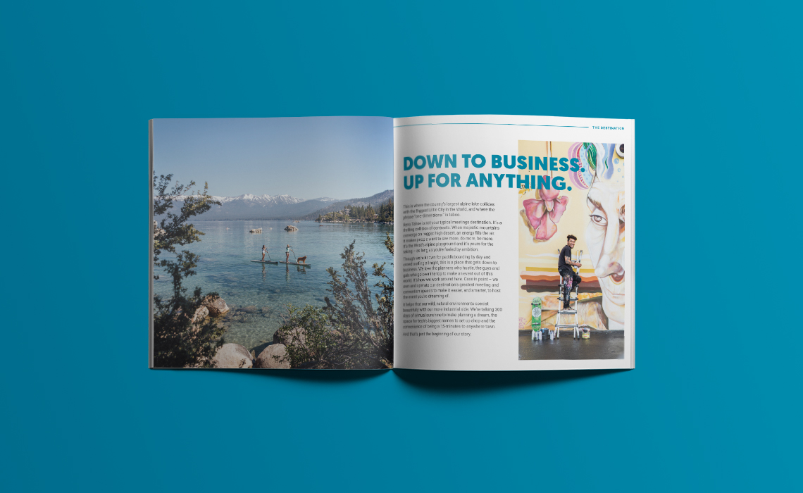
The Meetings and Conventions Planner is a full, 32-page booklet that covers the RSCVA’s full scope of meetings and convention offerings. Though the tourism campaign carries serious sizzle, the destination receives a huge amount of income from meetings and conventions. It was our job to make sure the new Planner design could carry that weight and look damn good doing it.
MORE STORIES FROM THE BLOG
RODI: Design Investment as a Business Tool
It’s easy to dismiss design as surface-level polish, but in reality, it is a business tool—and
2025 U.S. Capitol Christmas Tree Logo
An initial engagement with a new client always carries a degree of uncertainty. We were introduced
Bringing Branding Back into the Physical World
Do you remember the last birthday card you got? You can probably remember who sent it,