No construction company has left quite the stamp on our area as Clark/Sullivan Construction has. After building the Nevada Museum of Art, the Reno Ballroom, the Reno-Sparks Convention Center, the Renown Tower, and dozens of University of Nevada, Reno campus buildings, the Clark/Sullivan portfolio is brimming with over 3 decades of city landmarks. Since expanding to Sacramento and Laramie, Clark/Sullivan Construction has begun a careful process of remodeling the way they do business.
Clark/Sullivan has been steadily moving from hard-bid methods that helped them survive the recession to a collaborative industry model known as construction management at risk (CMAR), where they focus on working together with owners, architects, and developers to exceed building expectations. Now, they just needed an image overhaul to reflect that.
“The big ‘aha!’ moment for us was discovering people were more important than the facilities they build,” said Stan Byers. “People are a much bigger part of the equation than the artifacts they leave behind.”
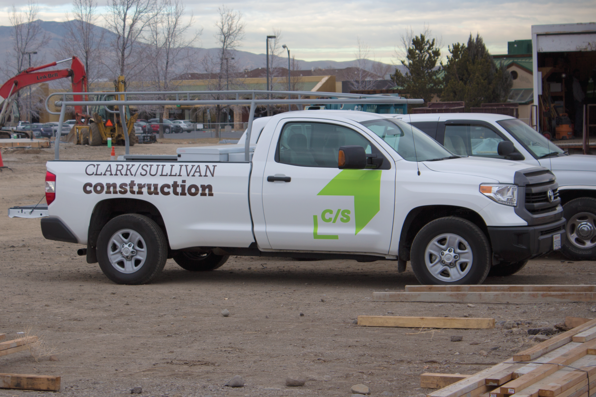
Through our brand discovery meetings, we realized the people that make up Clark/Sullivan Construction were competitive, collaborative individuals who loved coming to work every day. They consistently mentioned making a positive impact with their work, so we sought to create a logo that reflected those qualities.
The “C/S” in the logo was a conscious decision towards the future, as the sole owner of the company, B.J. Sullivan hopes to soon transfer ownership of the company to his employees. This gives them less of a name and more of an identity to rally behind. The final aspect of the project was a brand new website that puts their people front and center. The site also features a clean, photo-centric portfolio of work that the C/S staff can display with pride.
MORE STORIES FROM THE BLOG
2025 U.S. Capitol Christmas Tree Logo
Our two biggest rebrands of the year are back in the spotlight. Stan Can Design has
Bringing Branding Back into the Physical World
Do you remember the last birthday card you got? You can probably remember who sent it,
How to Write a Good Creative Brief
Most people think copywriters, designers, and other creatives are just these loose-cannon, freewheeling
