
Organizations like the Reno Philharmonic have been around long before Reno was the up-and-up mountain west tech town that many people might see today. As Reno’s largest musical organization, they deserve much of the credit for the eclectic and wonderful path the city has taken, enriching the cultural lives of northern Nevada since 1969. As they near their 50th Anniversary, they sought out Stan Can Design™ to reevaluate their brand and visual identity to better reflect that.
Our solution was an energetic new logo that shed light on various aspects of the Reno Phil brand: music, love, and environment. The artwork is loosely based on an audio waveform, with 8 bars to represent a chromatic scale. Purposeful staggering of the bars mimics both a pulse and northern Nevada’s mountainous horizon.
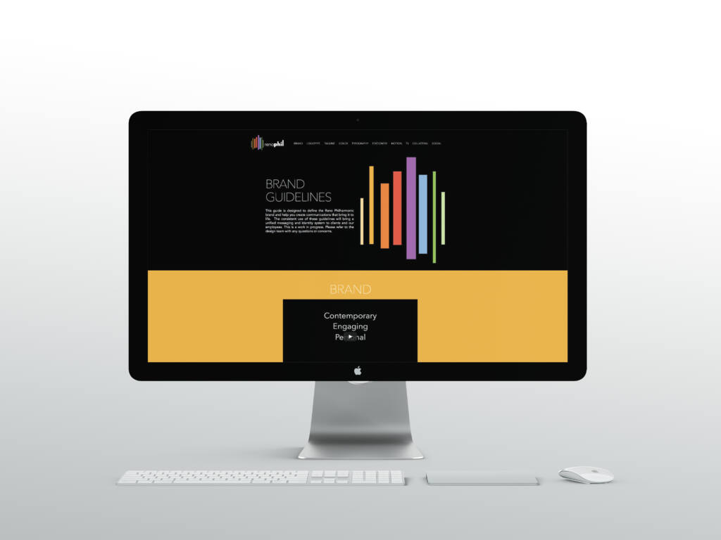
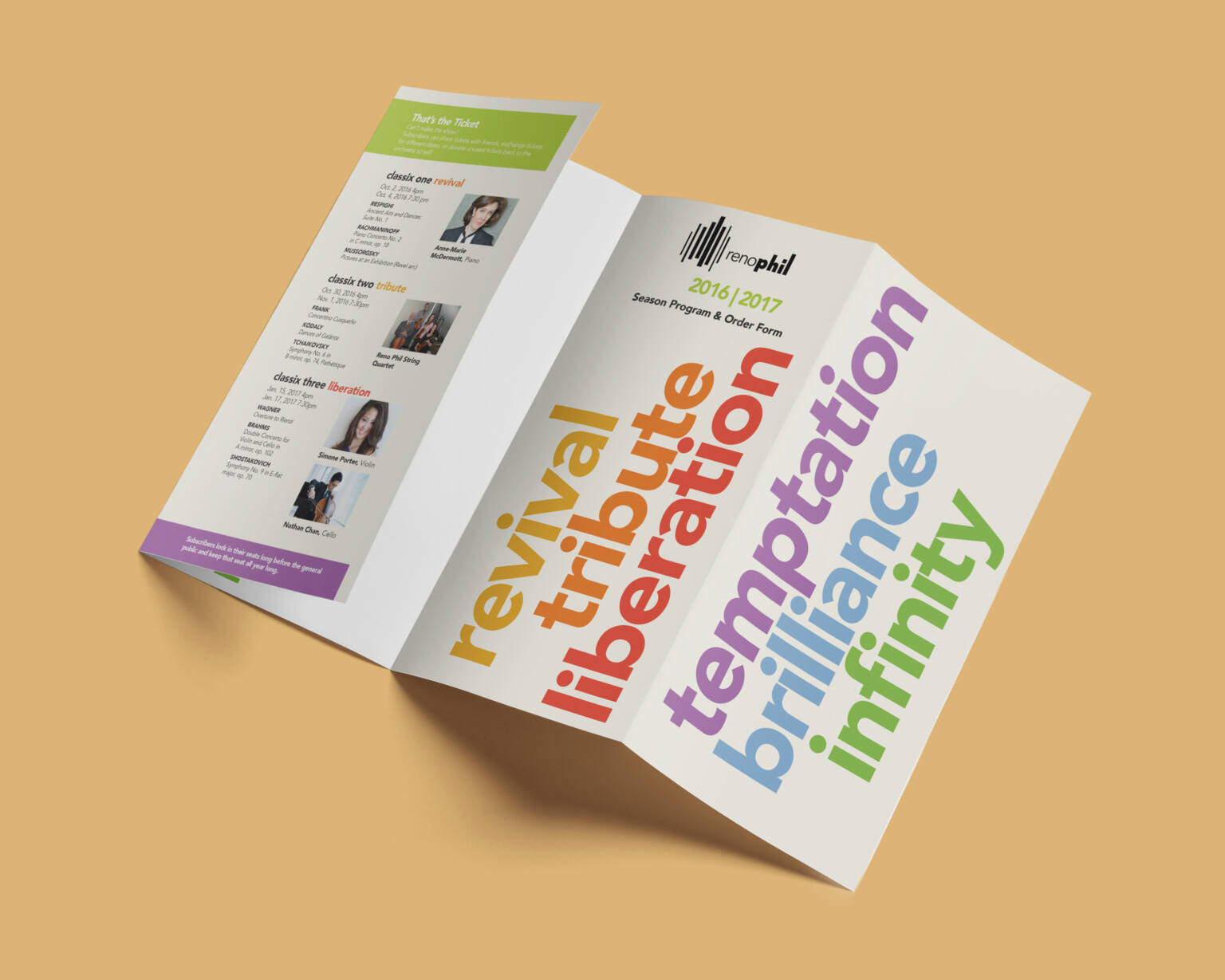
The brand’s color choice is as dynamic as the music they play. We set up color palettes that transforms based on the season or medium, the same way the Reno Phil selects their music for each of their concerts. Each business card adapts and changes its tone to match the person behind it.

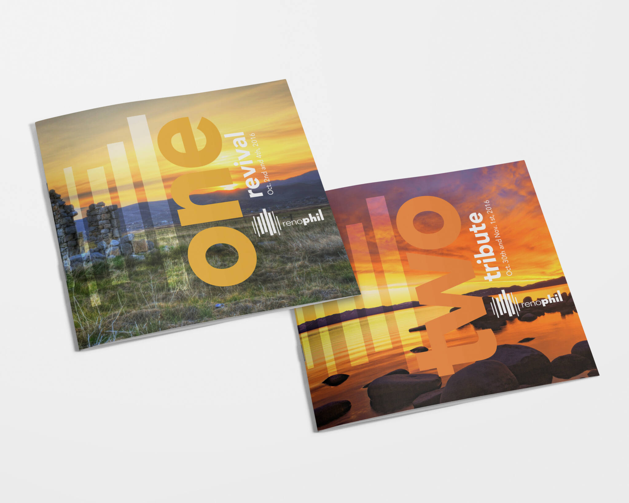
The Phil’s new brand is very much rooted in our natural environment. For every month’s Classix Series concert, program cover features photos of northern Nevada that align with the season. The Phil does the same with their music selections.
The brand crescendos with a tagline that captures the personal live music experience the Reno Phil has been producing for nearly 50 years. “Let’s Play” is more than a call to action, it’s a promise that anyone with even a hint of passion for good music is welcomed by the Reno Phil.
Visit the Reno Phil’s website for information on this year’s 6 part Classix concert series and stay tuned to our blog for more of our work with the Reno Phil.
MORE STORIES FROM THE BLOG

RODI: Design Investment as a Business Tool
It’s easy to dismiss design as surface-level polish, but in reality, it is a business tool—and
2025 U.S. Capitol Christmas Tree Logo
An initial engagement with a new client always carries a degree of uncertainty. We were introduced

Bringing Branding Back into the Physical World
Do you remember the last birthday card you got? You can probably remember who sent it,
