January 1st might have been eight days ago, but if you ask us, the New Year doesn’t begin until we survive the first week back to work. While we sip our third cup of coffee before 10am, many of our beloved clients are starting fresh this year with all new brands and logos to stand behind by the Stan Can Design™ team. Let’s take a look at some of our best rebrands from 2014.
Red Line Design, LLC
The Case:
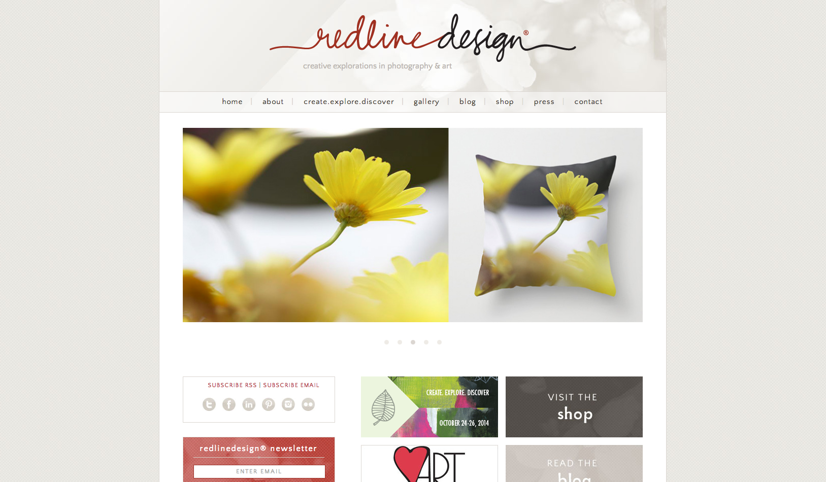
Red Line Design, LLC originally started as a boutique interior design firm for one Sarah G. Stevenson. As Sarah developed her business, she gained a network of followers devoted to her personal art blogging and creative newsletters that emphasized personal exploration. After the first of many successful Create.Explore.Discover. Art Retreats, Sarah wished to shift the focus of Red Line Design, LLC to art and creative exploration.
The Solution:
A business that’s all about personal exploration deserves an extra personal logo. To convey the same sort of intimacy and humbling nature of Sarah’s work, Kelly Wallis hand-lettered an original wordmark for Red Line Design, LLC. Furthermore, the “line” of Red Line Design, LLC has a creative mind of its own. It wraps around, fills, and explores the space of various paper materials and packaging for the brand. “The result is a logo that reads ‘Red Line Design,'” said Stan Byers. “But really says ‘Meet my good friend, Sarah.”
Clark/Sullivan Construction
The Case:
A collaborative team of competitors who enjoy working with people, Clark/Sullivan Construction were looking to shed the hard-bid construction company image that they wrongfully earned whilst wading through the construction industry’s recession issues. At the same time, owner B.J. Sullivan also is looking to transition his company to a shared endeavor amongst C/S leaders as he plans to retire.
The Solution:
It was clear to us that the new Clark/Sullivan logo not only needed a vibrant and progressive look, but it also had to be something of an insignia to rally troops behind as the company transitions ownership. The result is a shape that exudes both the business purpose and mentality – on separate planes! From one angle, a building block conveys Clark/Sullivan’s mission to create facilities that communities can be proud of, while the upward pointing arrow from another angle denotes the positive and progressive impact that C/S works to achieve with their projects. It’s all done in an energetic Sparks green in a tribute to the city that their headquarters resides in. Their new website is on the way as well, so check back soon!
CWX Architects
The Case:
CWX Architects is a young, Midtown-based architectural firm that continues to blossom under the leadership of owner and lead architect, Carlin Williams. Using innovative delivery methods and an eye for timeless design, the firm sought to call attention to their strengths while developing a brand that would help them gain work outside of Carlin’s established business connections.
The Solution:
Of course, Stan Can Design is also a fan of timeless design, and so we set to work on a logo that conveyed this to CWX’s prospective clients. Hard, straight lines pay tribute to the history and craft of architectural design. Along with geometric shapes and an easily readable typeface, CWX now sports a fresh logo that is just enough old school and the perfect amount of new hotness.
Fifty South Virginia
The Case:
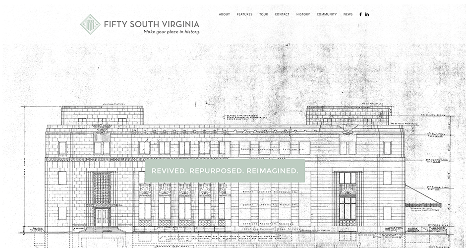
You might not have heard of Fifty South Virginia yet, but you might have heard of the old post office in downtown Reno. Thanks to the efforts of developer and project manager, Bernie Carter, the old post office is now Fifty South Virginia, a wonderfully historic and reimagined business space that stands as Reno’s beacon of revival. Originally finished in 1934, the structure has been sympathetically renovated to not only maintain its original charms, but also to restore those that were lost over the years. The final step was a cohesive brand, logo, and website in order to market to prospective tenants.
The Solution:
Ludmila CPA
The Case:
It would have been easy for Ludmila Smith-Popper to establish her career on nothing more than her skill as a CPA. In 2005, she was the highest scoring CPA candidate in the State of Nevada and, within a short time, rose to partner of a Reno accounting firm. Instead, she established her success on fostering 1-on-1 business relationships with her clients and believing that hiring a CPA is always a positive experience, despite others’ reasons for doing so. It was clear that we needed to make this the center of conversation while crafting a strong brand image to allow her to continue expanding her client base, eventually venturing into different regional markets.
The Solution:
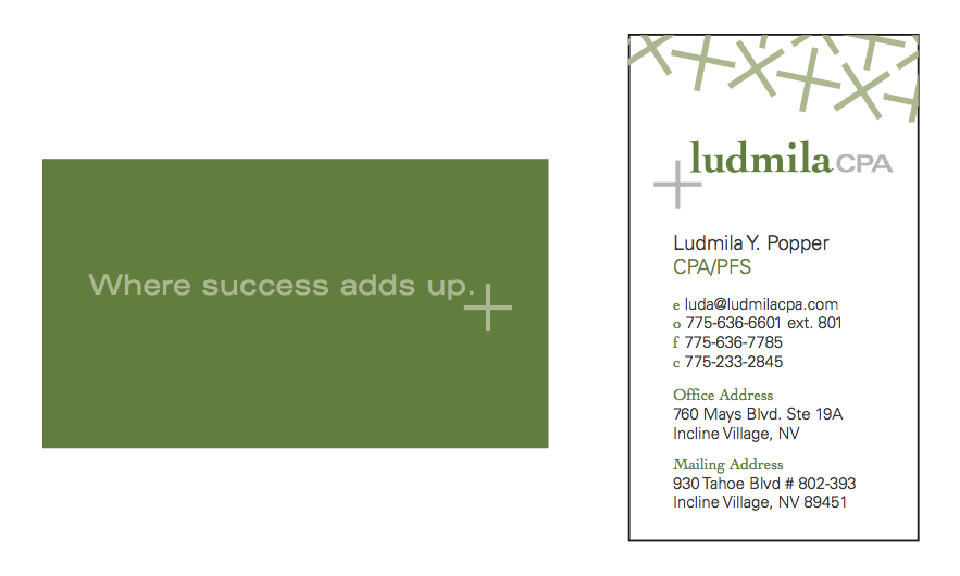
Clean, professional, and, most importantly, positive! Ludmila’s new logo and brand is all the right things you’d want in someone you’ve trusted with your finances. The plus sign not only provides us with our positive edge, but lends itself to an awesome grid format for other brand elements. Her tagline, “Where success adds up” is a promise to everyone that walks in her door: hiring a CPA isn’t always a necessary evil. It can be a positive investment for the future.
MORE STORIES FROM THE BLOG
2025 U.S. Capitol Christmas Tree Logo
Our two biggest rebrands of the year are back in the spotlight. Stan Can Design has
Bringing Branding Back into the Physical World
Do you remember the last birthday card you got? You can probably remember who sent it,

How to Write a Good Creative Brief
Most people think copywriters, designers, and other creatives are just these loose-cannon, freewheeling


