Change doesn’t come easy. And when you’re a regional manufacturing leader as established as Tripp Enterprises, the task can feel like trying to turn around a supertanker.
Because in addition to building and manufacturing parts for the world’s leading companies for over 70 years, Tripp had also built a legacy. The legacy of being one of the longest-running, most successful manufacturing companies on the west coast; a company that has adapted and innovated at every possible opportunity in order to maintain that legacy. But their brand identity was jeopardizing all of that hard work.
Some background: For decades, Tripp Enterprises was known as Tripp Plastics, and Tripp Plastics was known as one of the most trusted manufacturers of plastic parts and machinery for casinos during their peak.
When the gaming peak became a downward slope, Tripp Plastics began to adapt and diversify their offerings. The new Tripp Enterprises represented a push towards new technologies and methods in machinery, metalworking, and custom manufacturing for a variety of industries. Now, the fresh-faced company was providing single source manufacturing solutions for leading companies in the aerospace, defense, healthcare, and energy sectors.
The new Tripp Enterprises had become much bigger than plastics. They also didn’t really like “Enterprises”. They had moved quickly to create their own visual identity around the company’s new direction, but the results were only a stopgap.
In our initial meeting with the Tripp Enterprises team, someone blurted out, “Why don’t we just call ourselves Tripp?” Yes. Agreed! A unique short word is designer heaven.

This was the original logo for the company before they had rushed to change their name to Tripp Enterprises. It was a favorite of the staff even though it hadn’t been in use for many years.
There’s too much complexity for this to be a good logo visually, but it has a lot of good things to work with:
- It’s ownable
- It’s unique
- It’s memorable
The holy trinity of any good logo. You can’t ask for much more, and so we knew this classic could lay the foundation for their visual identity going forward.
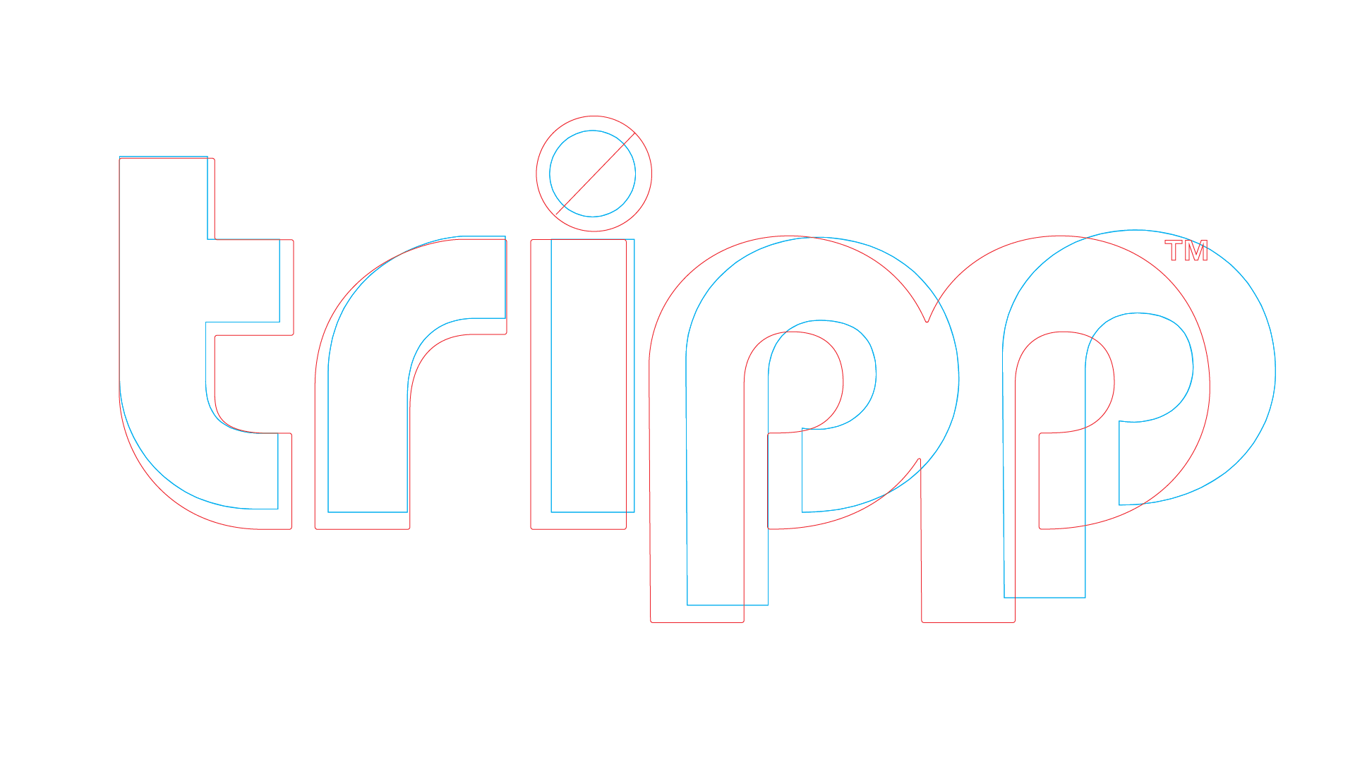
Although very similar, we knew the letterforms needed some work. You can see our revisions in red. We adjusted many of the curves and removed some of the sharp angles of the corners. We also took out quite a bit of extra spacing to create a solid, stable form.
Who needs to dot an eye when it stands in your way of progress? Removing the dot lets the letters flow smoothly from one to the other without interruption. We also made the descenders on the p’s longer to create space for future divisions in the branded house.
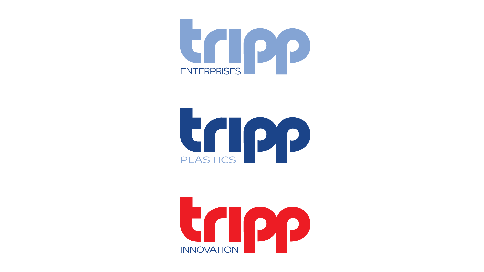
The word mark is strong enough that we can change colors without destroying the visual identity. If the form is correct, it will work in any color and, obviously, black and white. This lets us use color and trade dress to express personality for a more adaptable and flexible identity overall. With this type of system, Tripp can now add services and highlight them without starting from scratch every time.
"I couldn't be happier with the new brand from the Stan Can Design team. They understood our unique situation as a company and created a something that respects our history, but also positions us for future success. Their work has given us a competitive advantage in our market.
Cole Tripp – VP of Planning and Operations, Tripp Enterprises
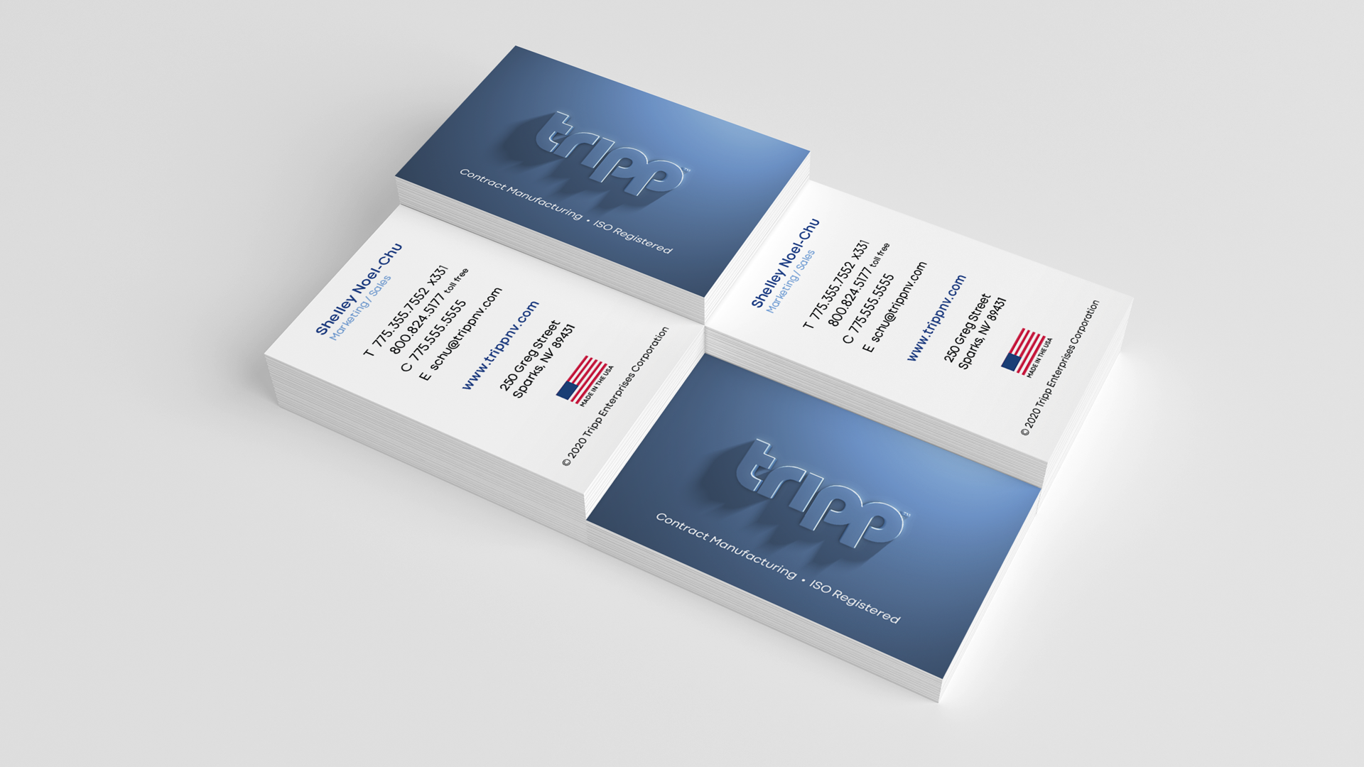
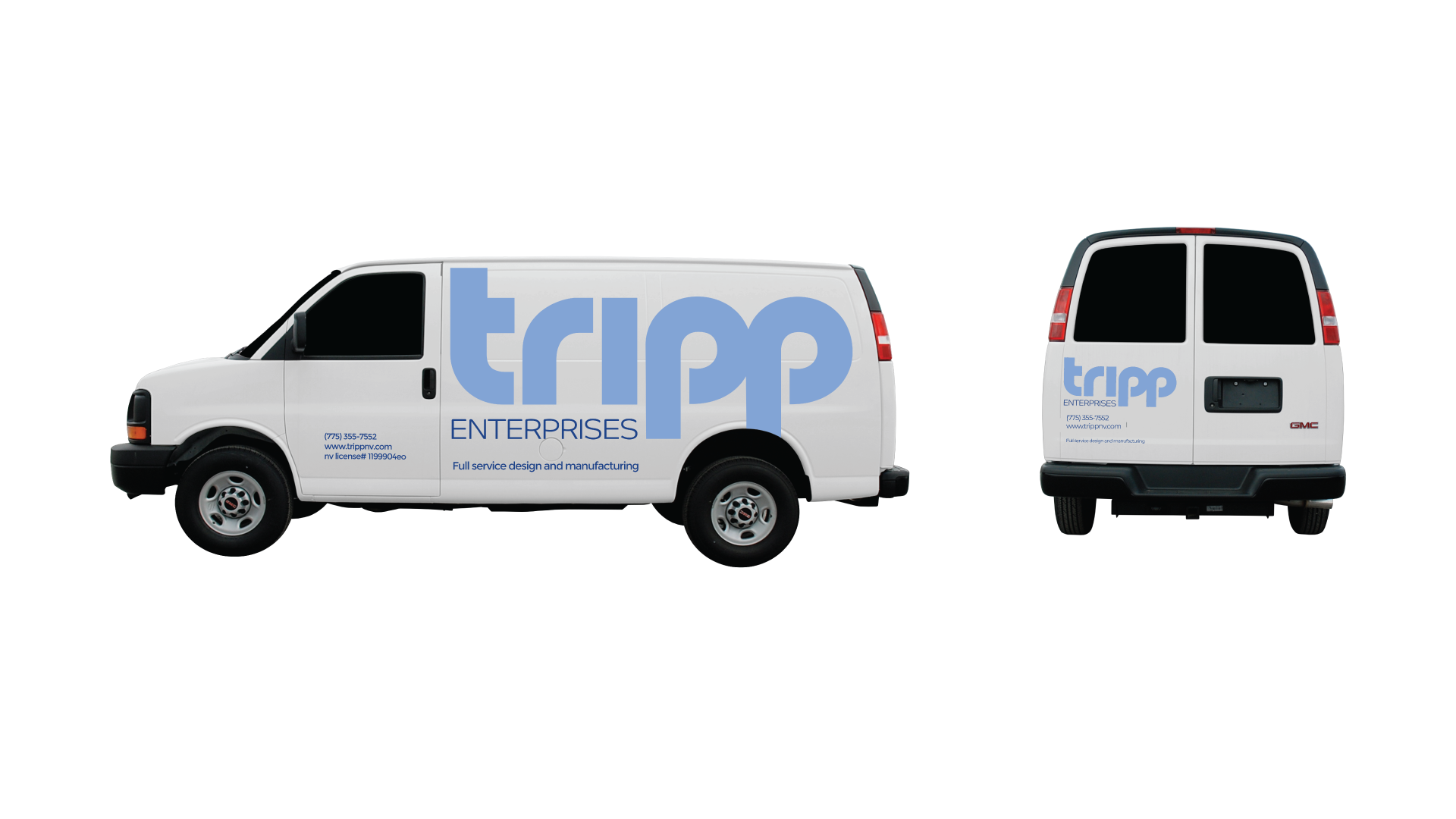
The result is a powerful, intelligent logo that looks and feel great at any scale. Its timeless appeal immediately positions Tripp as a leader in their category and asks potential customers “Why haven’t you heard of us, yet?”

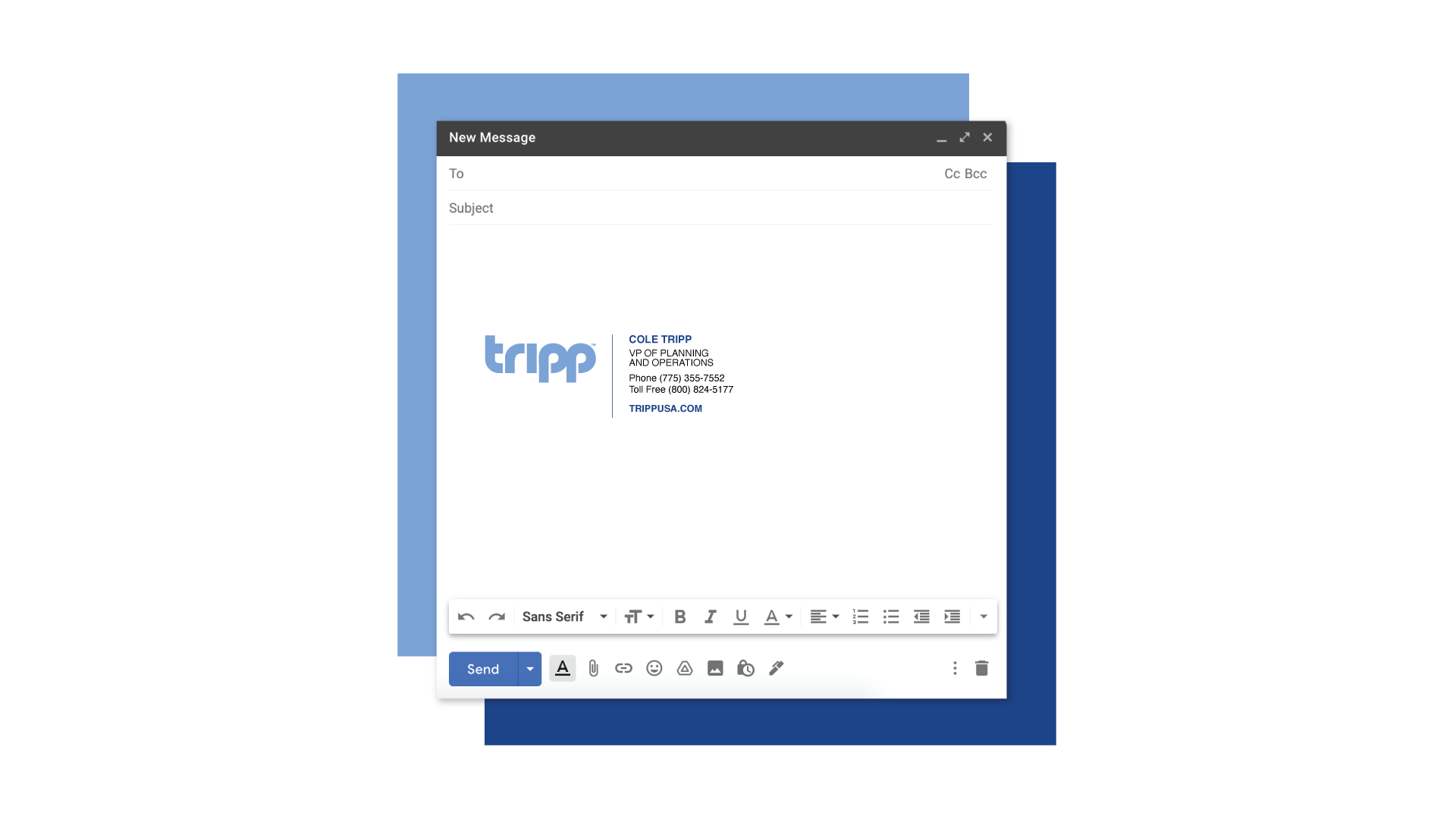
A sure sign of a good logo is if you can embroider it easily in one color and it looks great. But the sure sign of a great logo is the pride all of its stakeholders feel when using it and speaking of it. Case in point: the immediacy at which the Tripp team wanted to start using the logo in their email signatures.
MORE STORIES FROM THE BLOG
2025 U.S. Capitol Christmas Tree Logo
Our two biggest rebrands of the year are back in the spotlight. Stan Can Design has
Bringing Branding Back into the Physical World
Do you remember the last birthday card you got? You can probably remember who sent it,

How to Write a Good Creative Brief
Most people think copywriters, designers, and other creatives are just these loose-cannon, freewheeling
