Queen of Hearts High Tea by Soroptimist International of Truckee Meadows

Background: Soroptimist International of the Truckee Meadows (SITM) is a local service club in Northern Nevada that focuses on educating and enriching the lives of women and girls. First charted in 1978, SITM has been awarded over $1,250,600 in local scholarships. The Queen of Hearts High Tea, organized by the club’s fundraising committee, is one of the largest fundraising events of the year. All net profits are contributed to the Dream It Be It, Thanks to Youth, and Dreams Moving Forward scholarship funds. Event profits also go toward diaper, toiletries, and clothing drives for local non-profits.

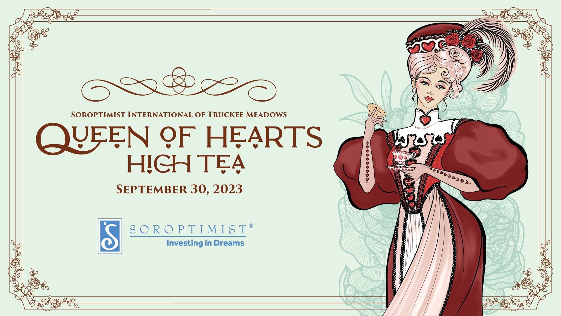
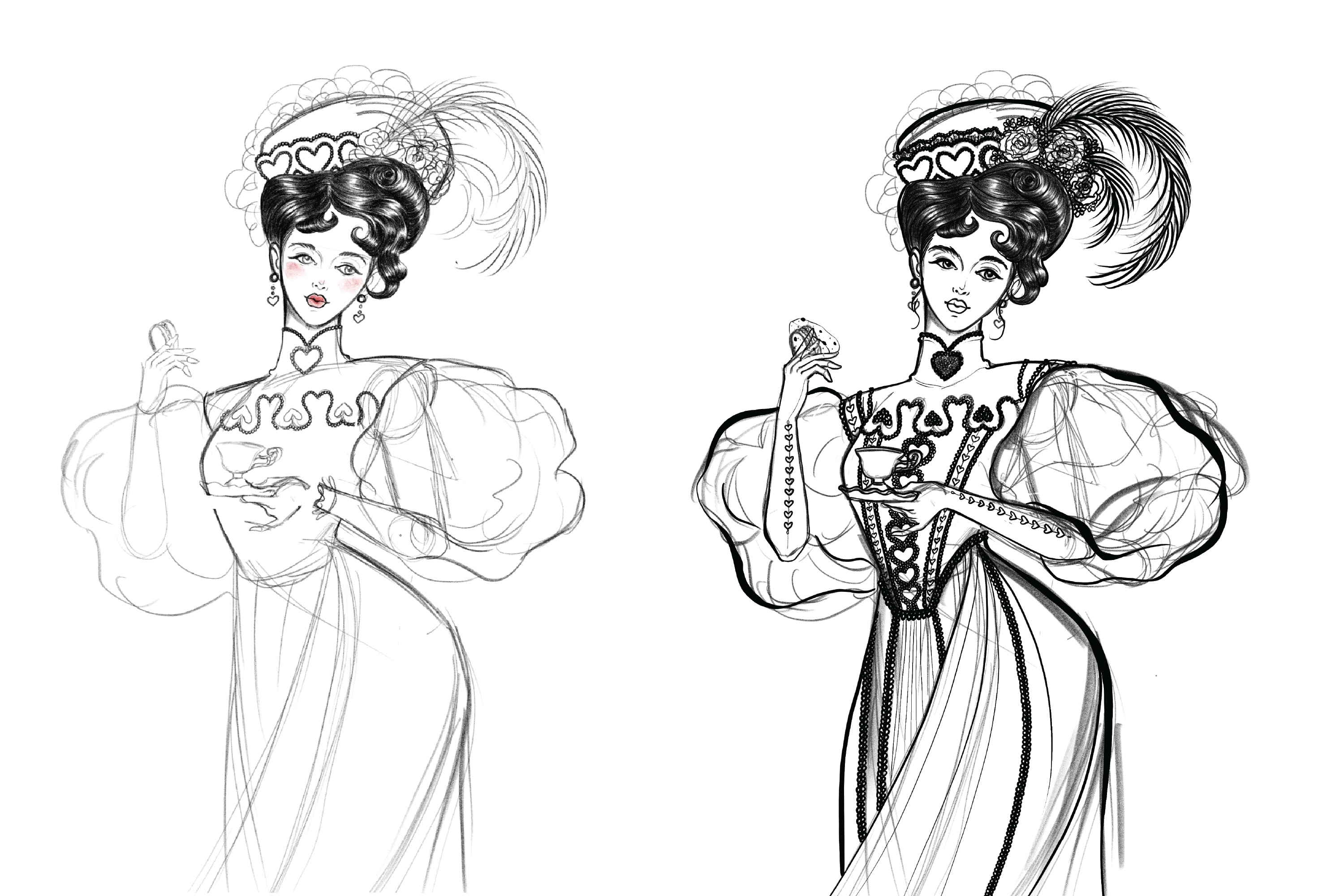
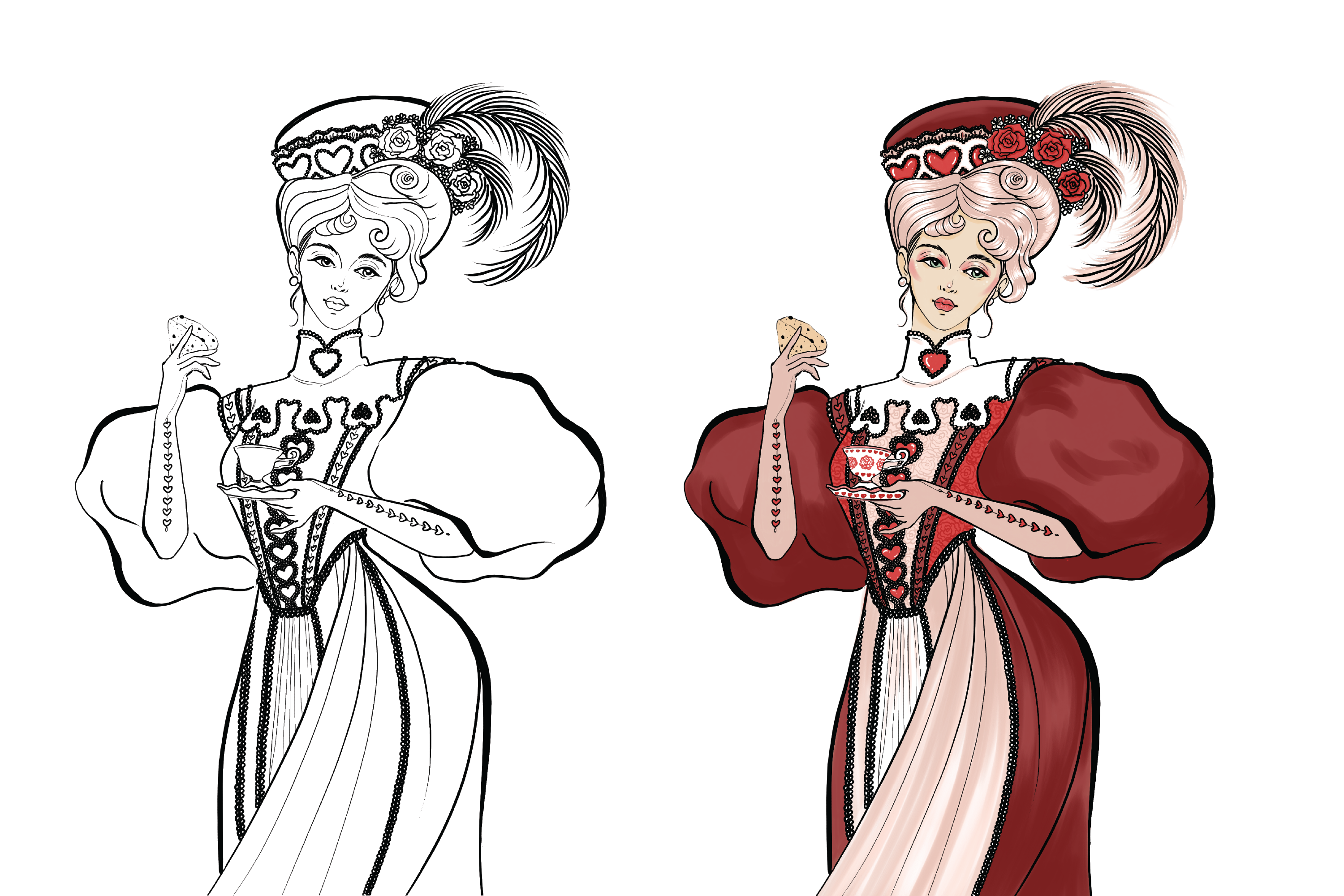
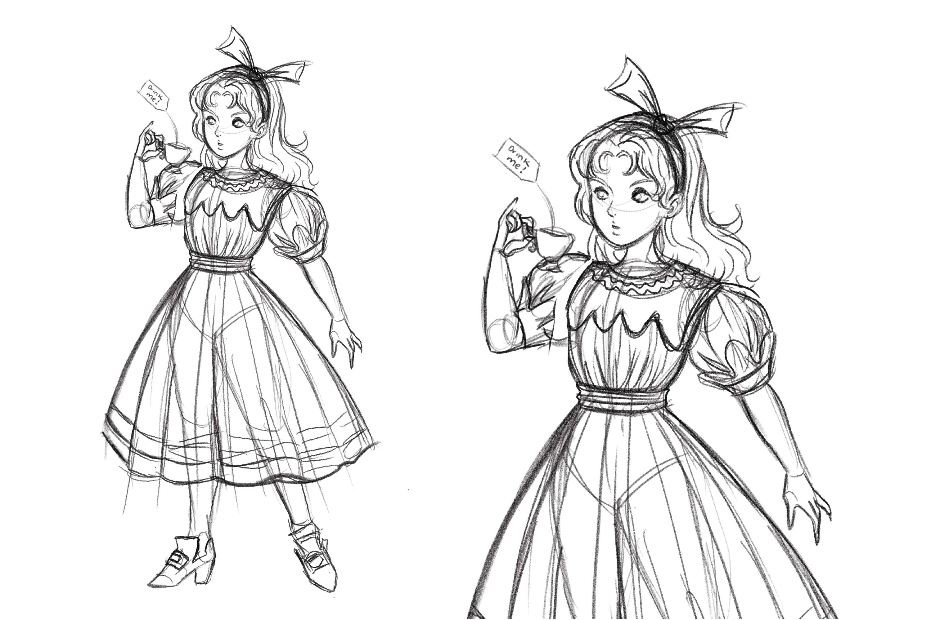
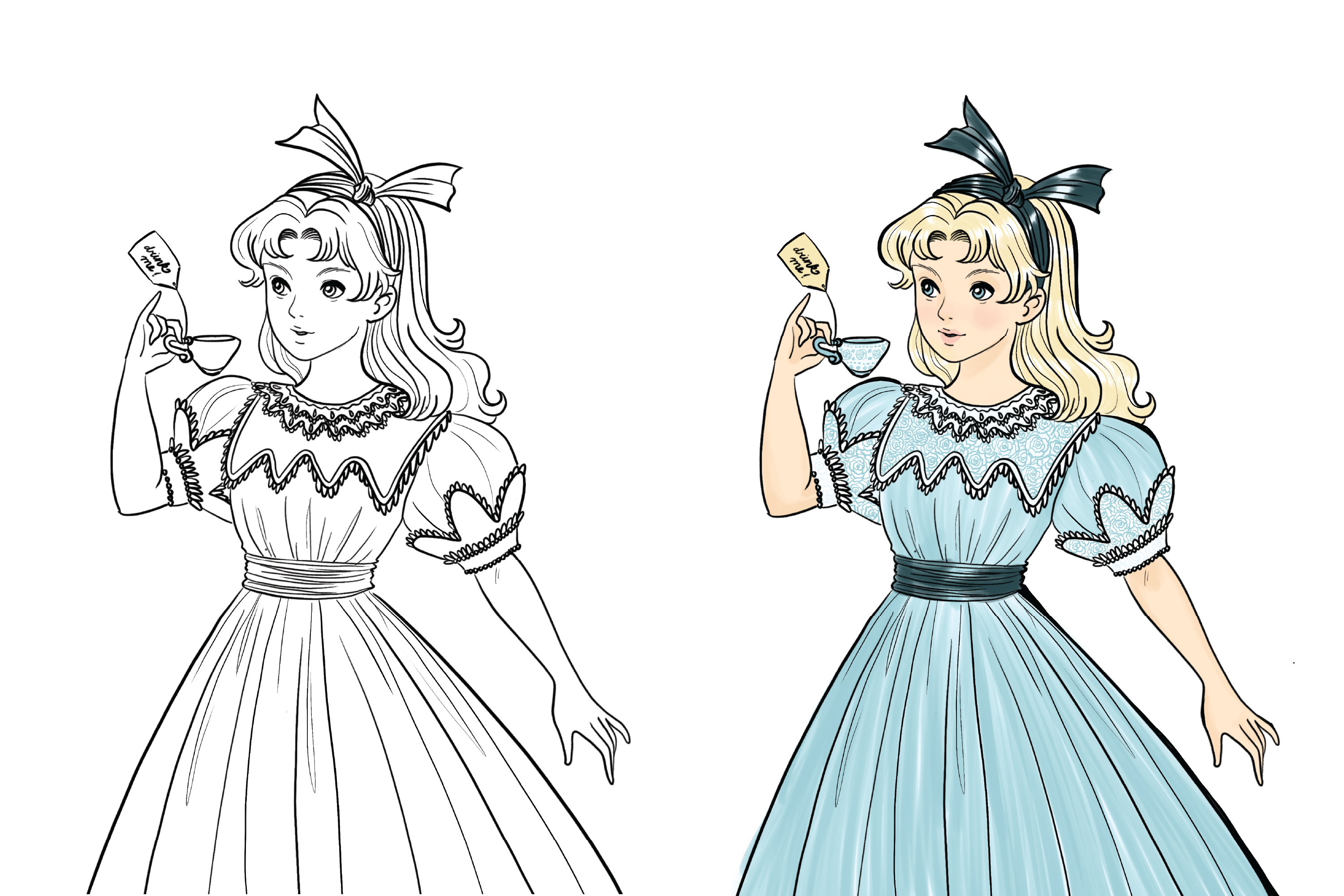
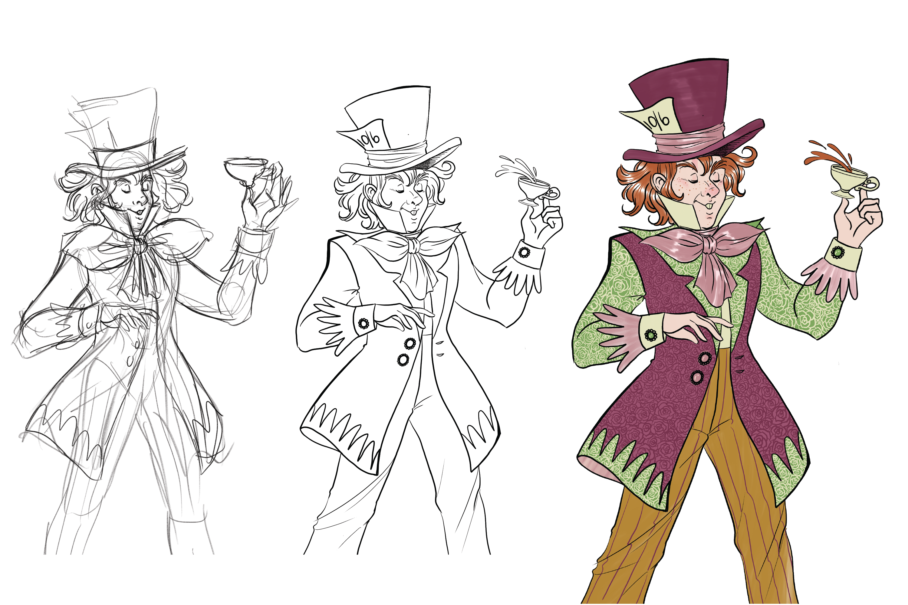
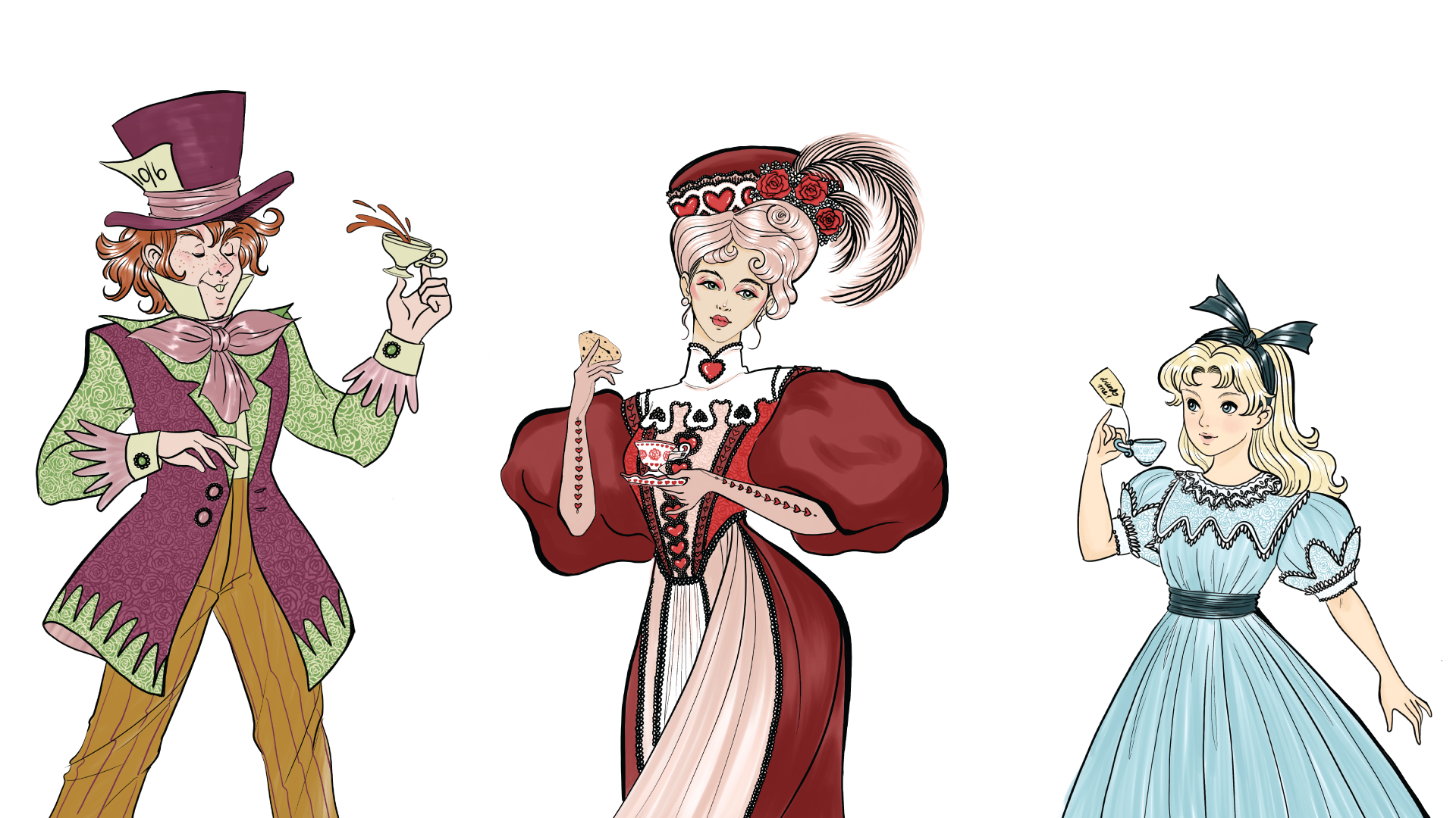
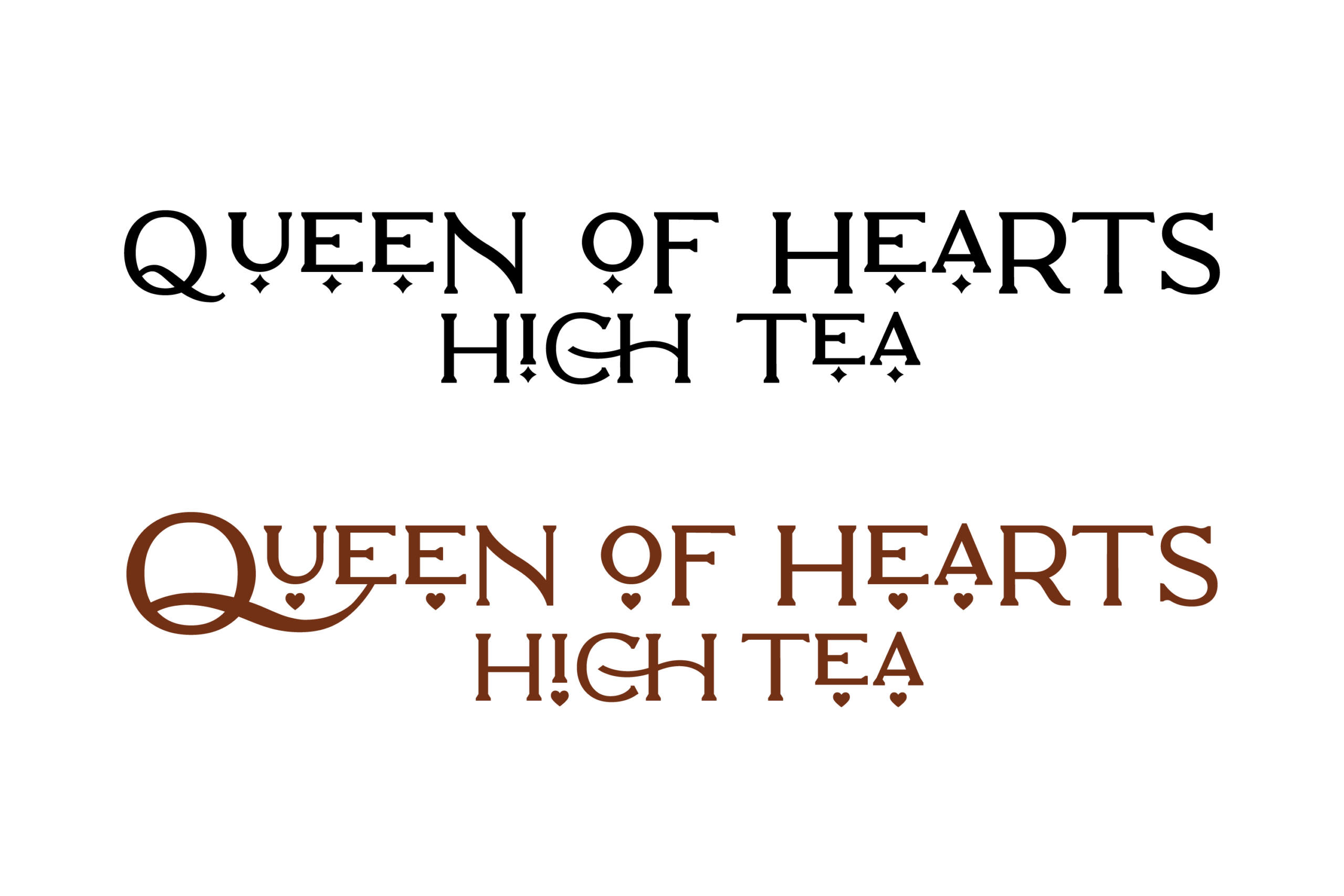
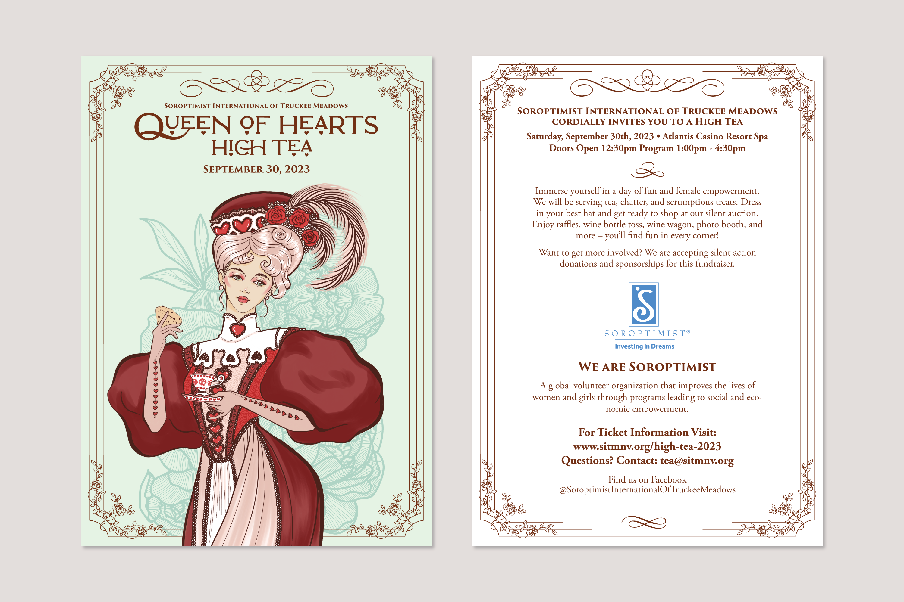
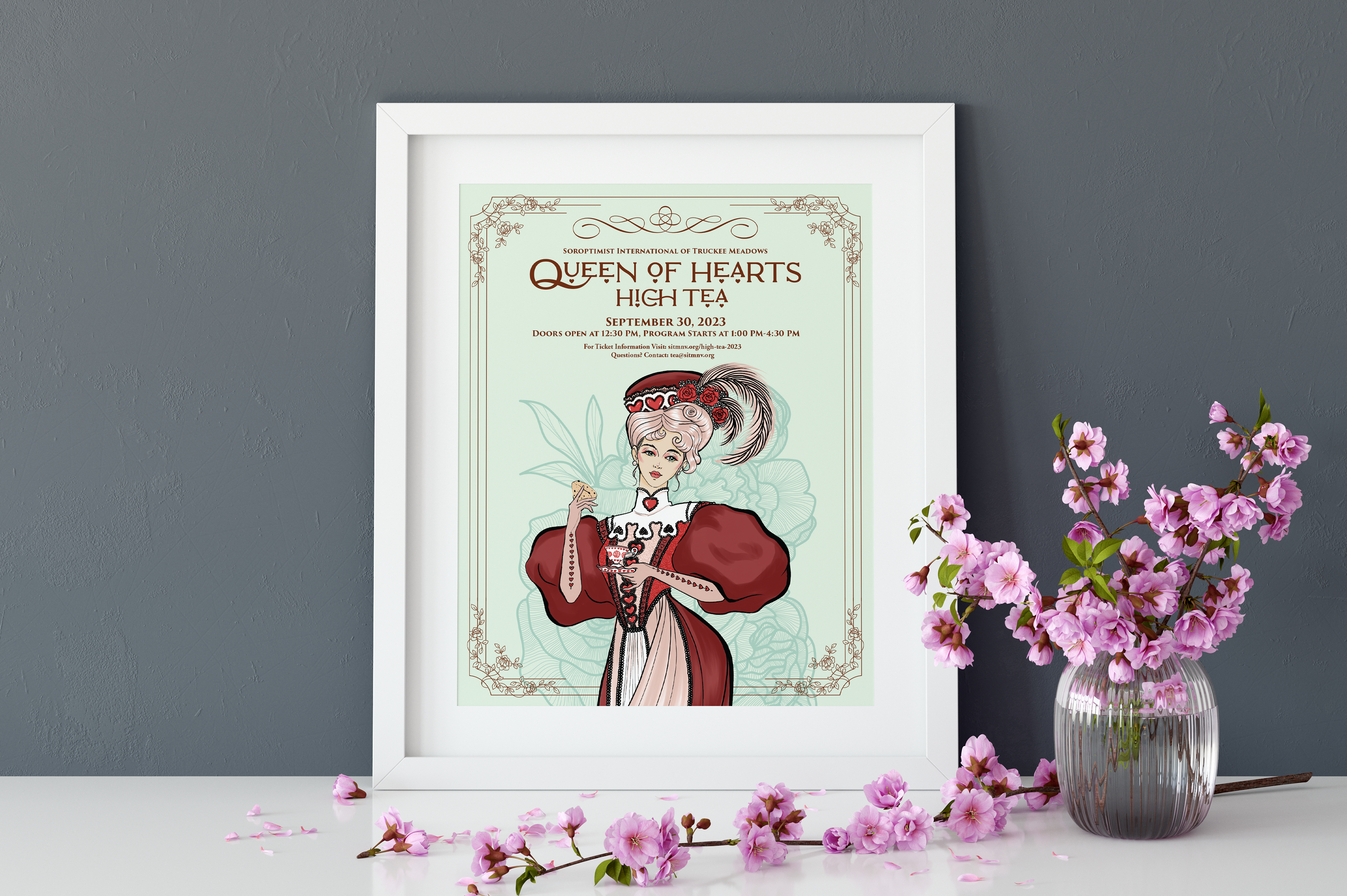
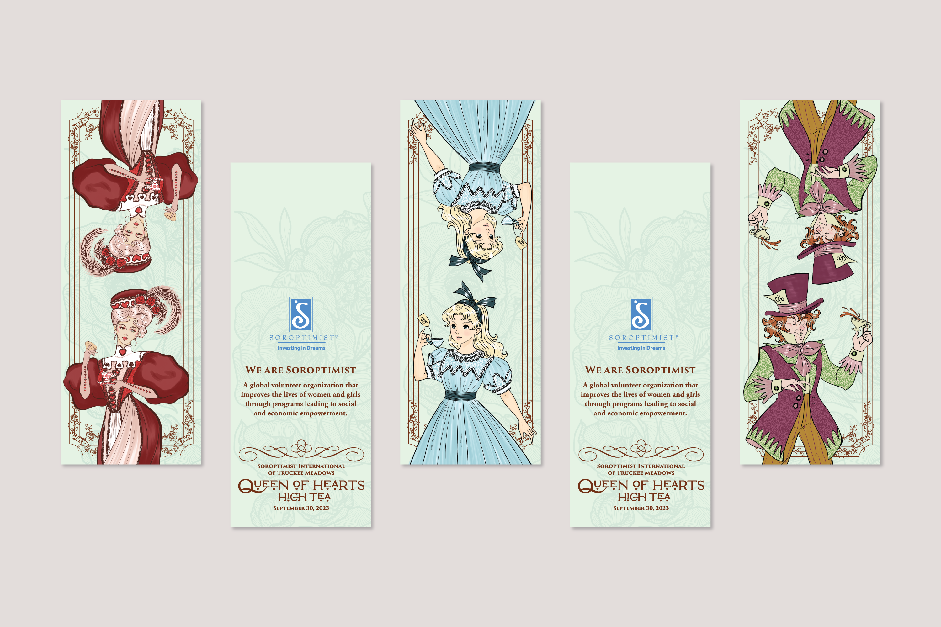
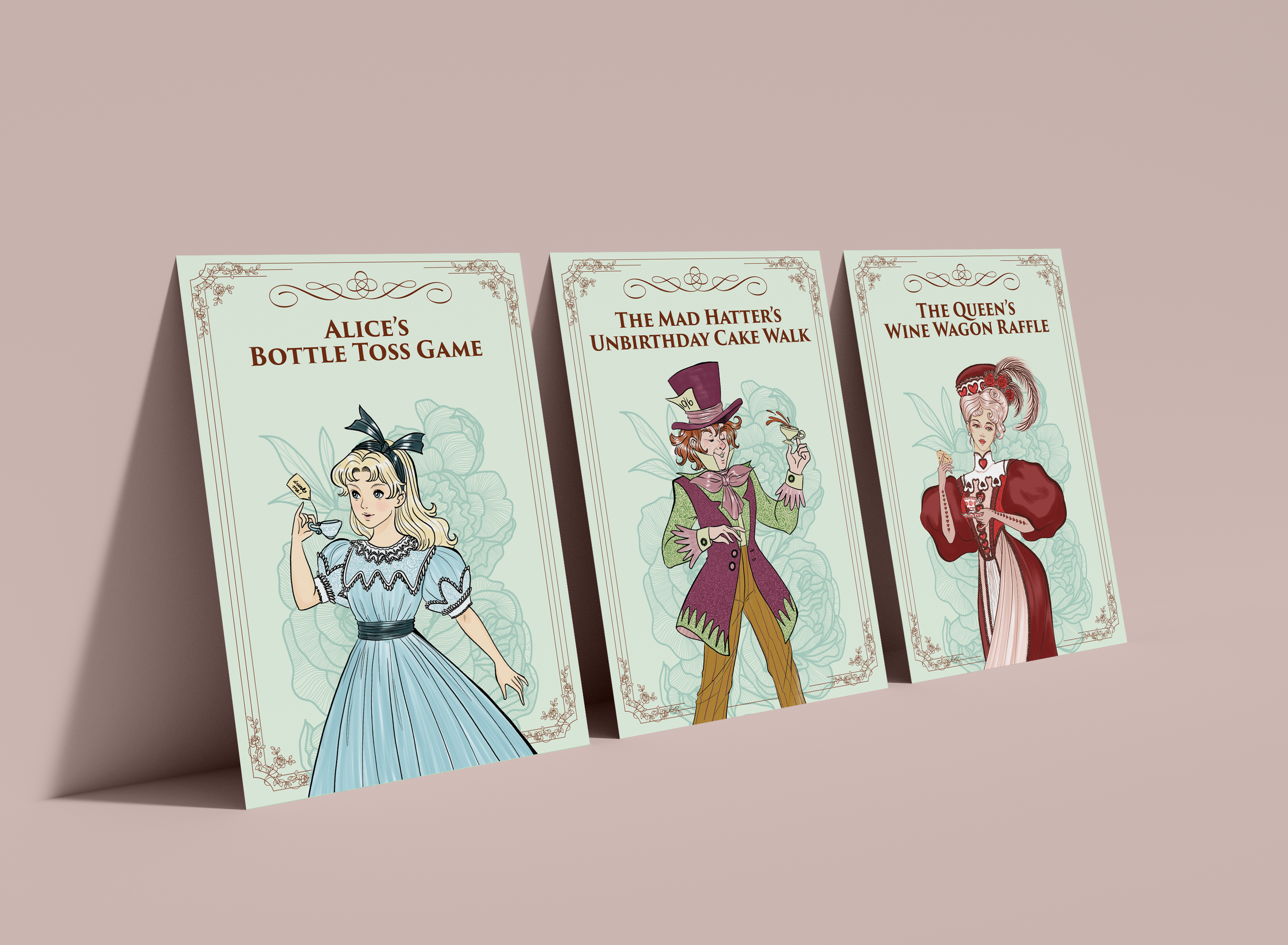
Objectives: Originally coined, “Mad as a Hatter High Tea” in 2019, the fundraising committee created this event as an entertaining way to raise scholarship funds. Hosted by the Atlantis, the event consists of traditional high tea sandwiches, pastries, and confections for guests to enjoy. The club raises funds through ticket sales of the event itself, a silent auction, games, and a wine wagon raffle. Inspired by “The Adventures of Alice in Wonderland”, the event encourages guests to either sport their best high tea attire or come dressed in an Alice in Wonderland costume. While the event always succeded in the club’s goal to raise funds for scholarships, collateral pieces such as printed tickets, event programs, and the event PowerPoint didn’t match the quality, elegance, and enthusiasm of the event itself.  The event, while wildly successful also didn’t create a cohesive visual identity that brought credit back to the club that organized it. 

Due to the COVID-19 pandemic in 2020 and 2021, the event had to be canceled, therefore breaking the momentum of the excitement from the 2019 event. When the event came back in 2022 it was still able to generate income for the club’s fundraising endeavors, but the event also decreased in scale and brought in a lower net profit. In 2023 the fundraising committee was informed that not only did food prices increase, but the club would also have to increase the number of attendees for the event venue to move forward in booking the High Tea event. In total the fundraising would have to increase their ticket sale by 30% in one year and ticket prices would have to increase to make a net profit that could be reallocated towards the club’s scholarship programs.  Additionally, the SITM club decreased by 200%, as existing members of the club did not renew their membership to support a new Soroptimist International charter in Northern Nevada. This created another objective to overcome, as a large percentage of the High Tea attendees were SITM club members. Therefore, marketing efforts to individuals outside of the club would have to prove more successful than ever in order to increase the event’s size and profits by 30%. 

As part of the fundraising committee process, we brainstormed and strategized over several ways to elevate the high tea event.  After hours of meetings to distill everything into the key insights that would increase event awareness, we created a focus on these primary objectives:

  • Create a cohesive visual identity system to increase the club’s pride and enthusiasm for the event while also drawing in curiosity from the general public for the event
  • Create a marketing strategy for the event in order to increase ticket sales and silent auction donations
  • Create both print and digital marketing pieces that make it easier for all club members to share with potential event attendees

Challenges: Several factors had to be considered when choosing a creative direction for the event promotional items and collateral. First, the design and imagery had to appeal to multiple age demographics. The typography, layout and illustration had to pull historical and cultural design elements.

Visual influences: The illustration for the Queen of Hearts is based on the illustration style of Charles Dana Gibson. We also drew fashion inspiration from clothing catalogs from the late Victorian and early Edwardian periods.

Time constraints: When it came to the creative direction and illustrations, most marketing materials were completed in a timely manner.However, the event program, sponsorship PowerPoint, and the club President’s speech PowerPoint had to be designed and final prepped in less than a week before the event. 

Specific demands: The design, illustrations and marketing collateral all had to appeal to a large demographic of women in different age groups. SITM’s club members consist mainly of women from the Baby Boomer and Generation X population. But in order for the event to be successful it was paramount to target attendees within the Millenial and Generation Z population.  

Solution: The event name was changed to, “Queen of Hearts High Tea” to honor and celebrate women. We wanted the event to be more fashion and costume-oriented and the name change helped further influence the event’s Visual Identity. The idea was to make the event name as elegant and beautiful as the event itself.

Additionally, a new logo was made for the event along with a design system that included custom illustrations of the Queen of Heart, The Mad Hatter, and Alice from The Adventures of Alice in Wonderland adorned in silky lace garments while holding porcelain teacups. 

The preliminary rough sketch of the Queen of Hearts is where anatomy and silhouette were explored. It was important to focus on fashion choices that reflected the Edwardian period while staying imaginative and whimsical at the same time. And of course, what is a high tea without a fabulous hat? The feathers were especially a nice touch as they guide eye the back to the subject matter’s face. The Queen of Hearts pose was also carefully considered, as her elegance, poise, and grace help tell a story. 

After the sketching process, line art was incorporated into the illustration with a classic newsprint-style ink brush. Illustrating the lines with variation added to the volume of the dress sleeves and movement.

During the coloring process, it was important to allow the queen to maintain the theme of red to follow the literature of Alice’s Adventure in Wonderland. However, this version of the queen needed to look like a hero rather than a villain. And above all else, she needed to be fashionable. This is where we took creative liberties with her fashion choices by making her whole ensemble monochromatic. And while her hair updo is technically an Edwardian favorite, the color itself pulls from the Frech Roccoco wigs of the 1700s. This creativity allows the illustration to delve into a more fantastical representation instead of following strict historical fashion trends. It also softened up her appearance. In the original sketching phase her hair was a dark color, which made her design look sinister combined with her red dress. 

The final important detail that would carry out as a consistent theme throughout the illustration set was the freehand-drawn roses in the Queen’s top garment. The details of these roses do not follow and strict mathematical pattern, they were drawn in organically to include an elegant texture to the Queen’s dress. 

Once the art direction was established with the Queen’s illustration, the next character we worked on was Alice. Her character design followed the original book illustrations giving her a light colored dress with a dark bow on her head as an accessory. Her dress however got a stylish upgrade to be in an appropriate fashion for a fancy tea party. We also included a “Drink Me!” tag as an easter egg from the original book. We followed a monochromatic color scheme for Alic’e attire by designing a light blue dress adorned with rose embrioded trimmings on her dress. 

Many of Alice’s dress details were improvised during the inking process since her sketch was much more rough than the Queen’s. Her collar sports layers of frills that mimicked children’s clothing catalogs from the Edwardian period. We took advantage of the frills and lace to incorporate the rose pattern incorporated in the Queen dress as well. 

To maintain the Mad Hatter’s cookey and chaotic nature, we made sure his appearance stayed carefree. We certainly needed to make sure he looked like a goofy merchant and not an aristocratic gentleman of the time. All while maintaining an air of elegance. We accomplished this juxtaposition by breaking free of the monochromatic color scheme and giving his apparel a complementary scheme of a muted warm red-violet with a vibrant yellow-green. 

Illustration Line-up
Event Logo
Event Postcard
Promotional Event Poster
Bookmarks
Event Game Posters

We brought cookies (but no milk).

We use cookies to personalize content and ads to provide social media features and analyze our traffic. You may opt-out of the use of cookies through your browser settings, which allows you to delete cookies that have been set.