For most developers, the equation is simple. Make properties, make profits. But at Tolles, there’s a greater purpose in play.
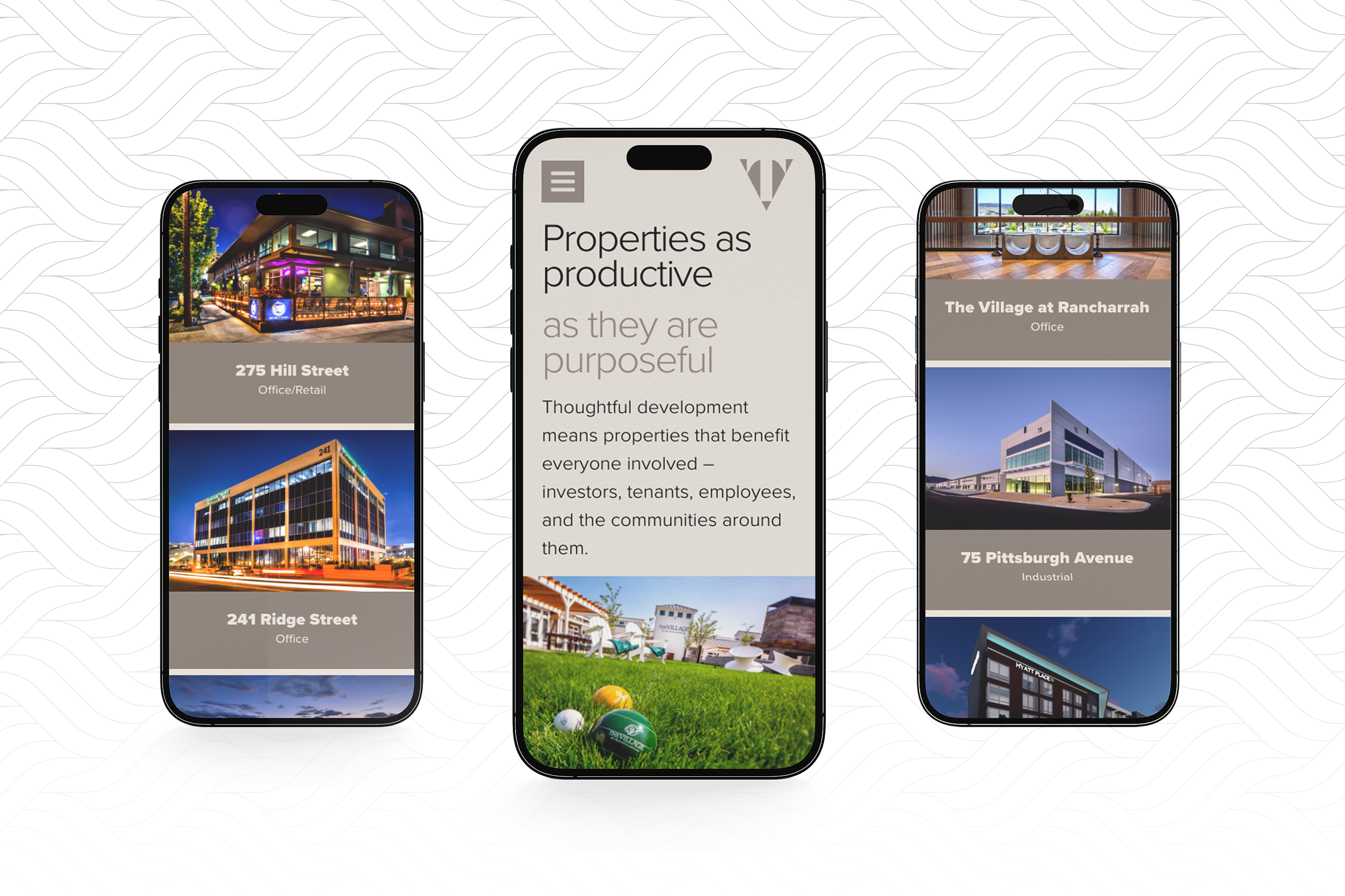
They’re not in this to just use up land and put up buildings for fun. There has to be intent. There has to be a benefit for the community. There has to be thoughtfulness.
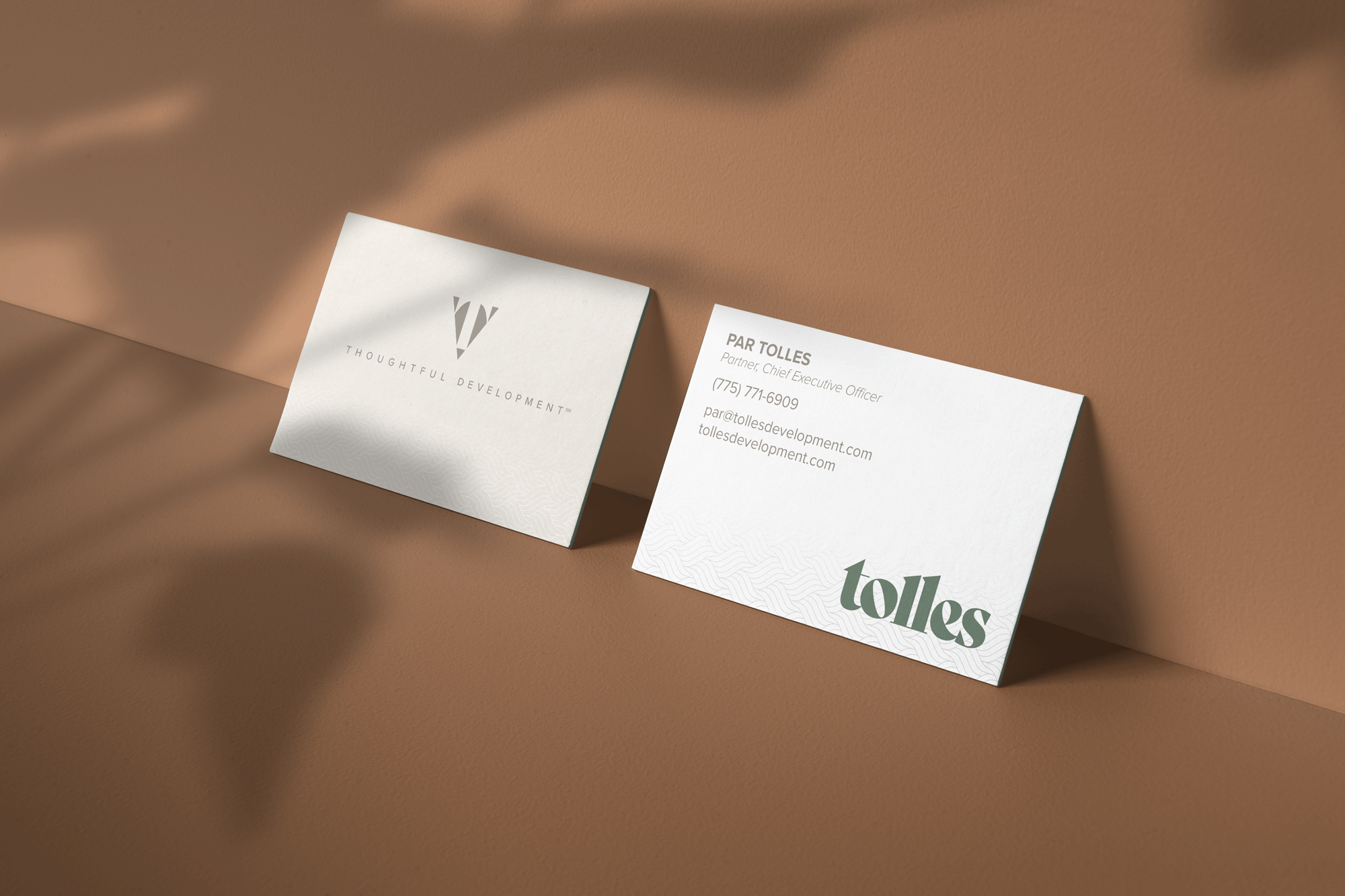
When the Tolles team came to us, they weren’t even called Tolles. Swapping between two different brand names and logos for much of their history, their identity didn’t have the same attention to detail that their company mission deserved.
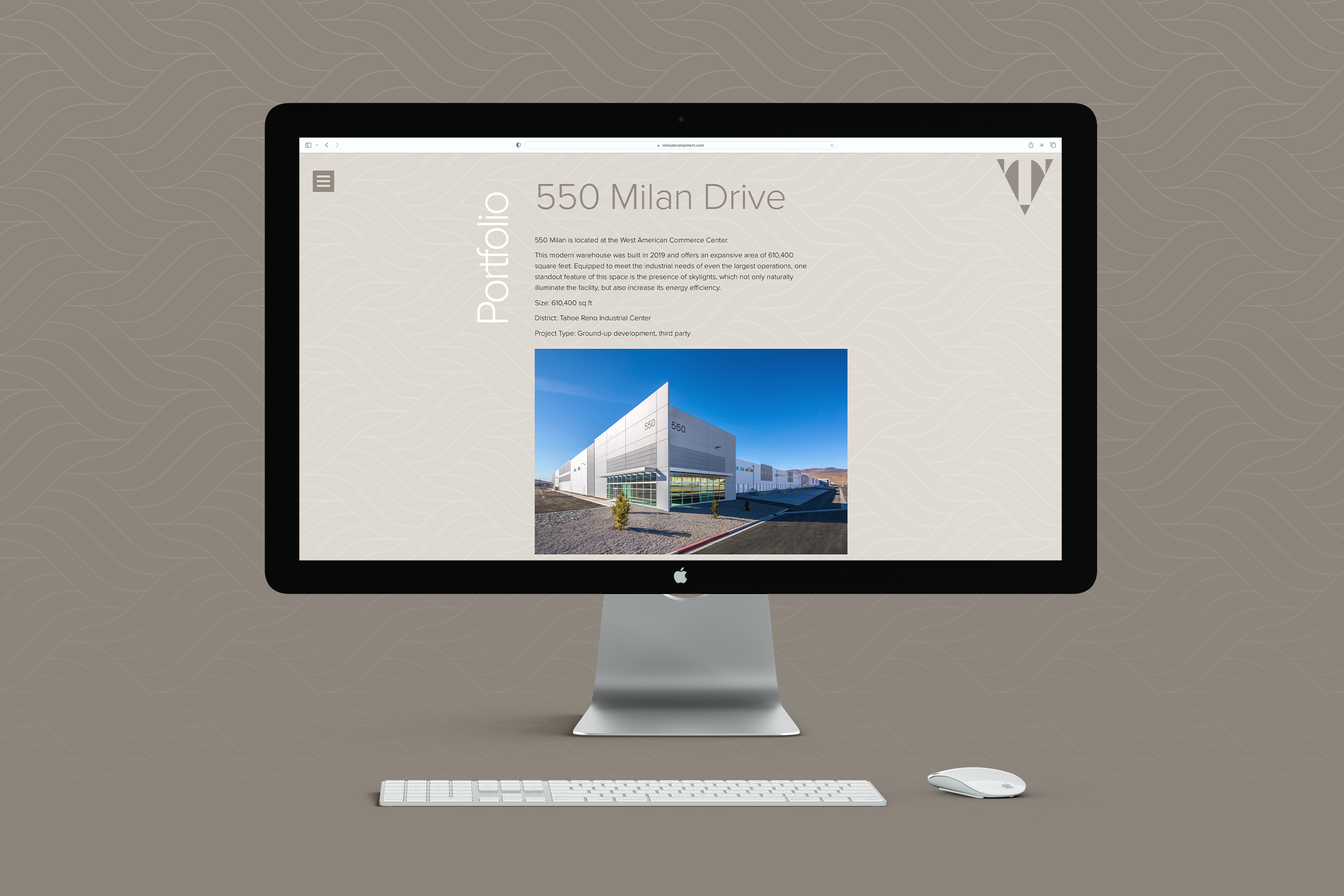
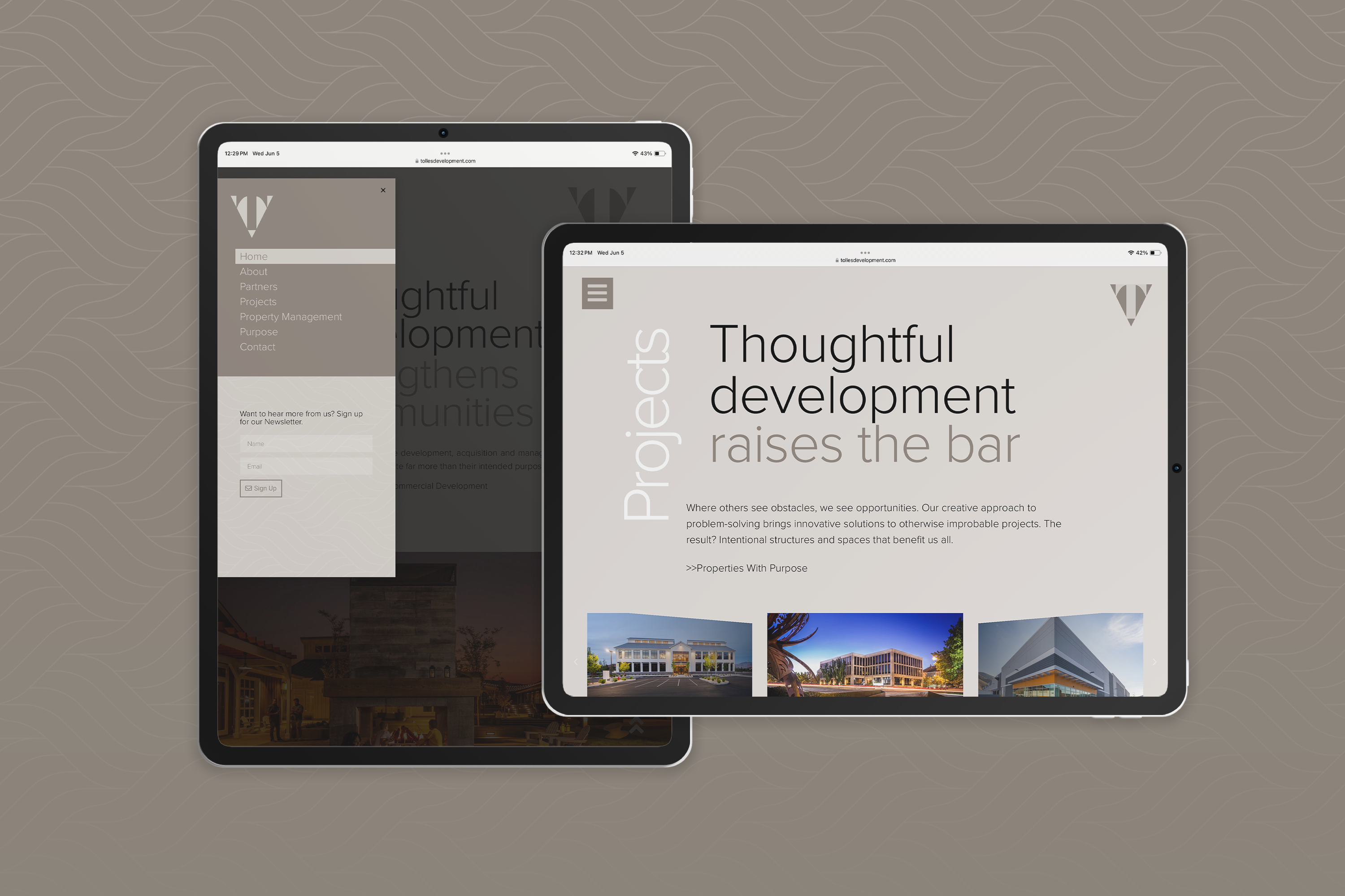
There was no mention of their people-first design approaches. Nothing about their ability to turn obstacles into opportunities. And far too little about the stories behind their properties.
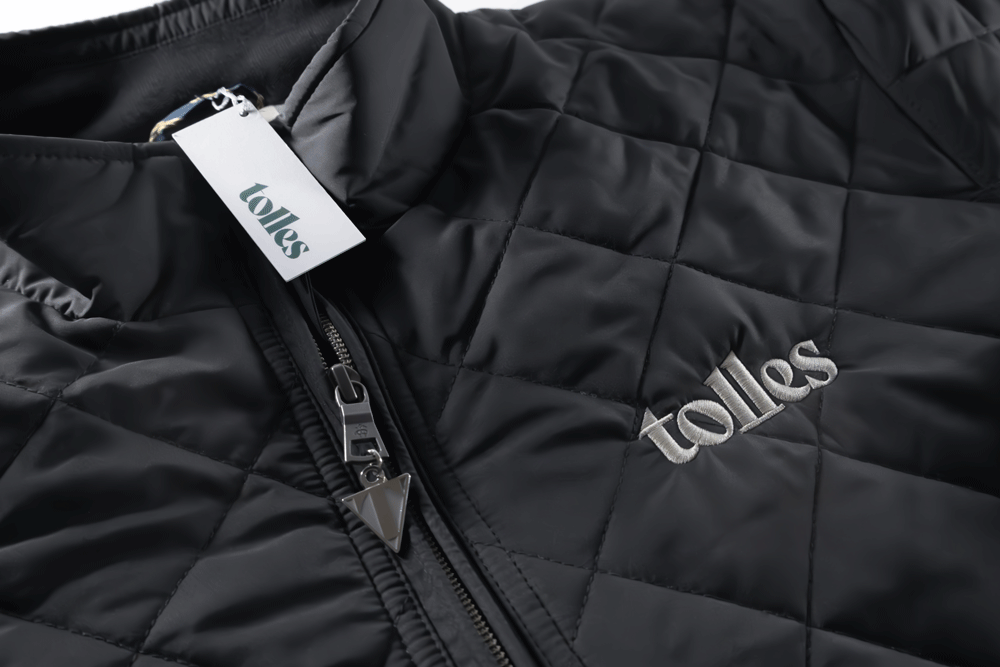
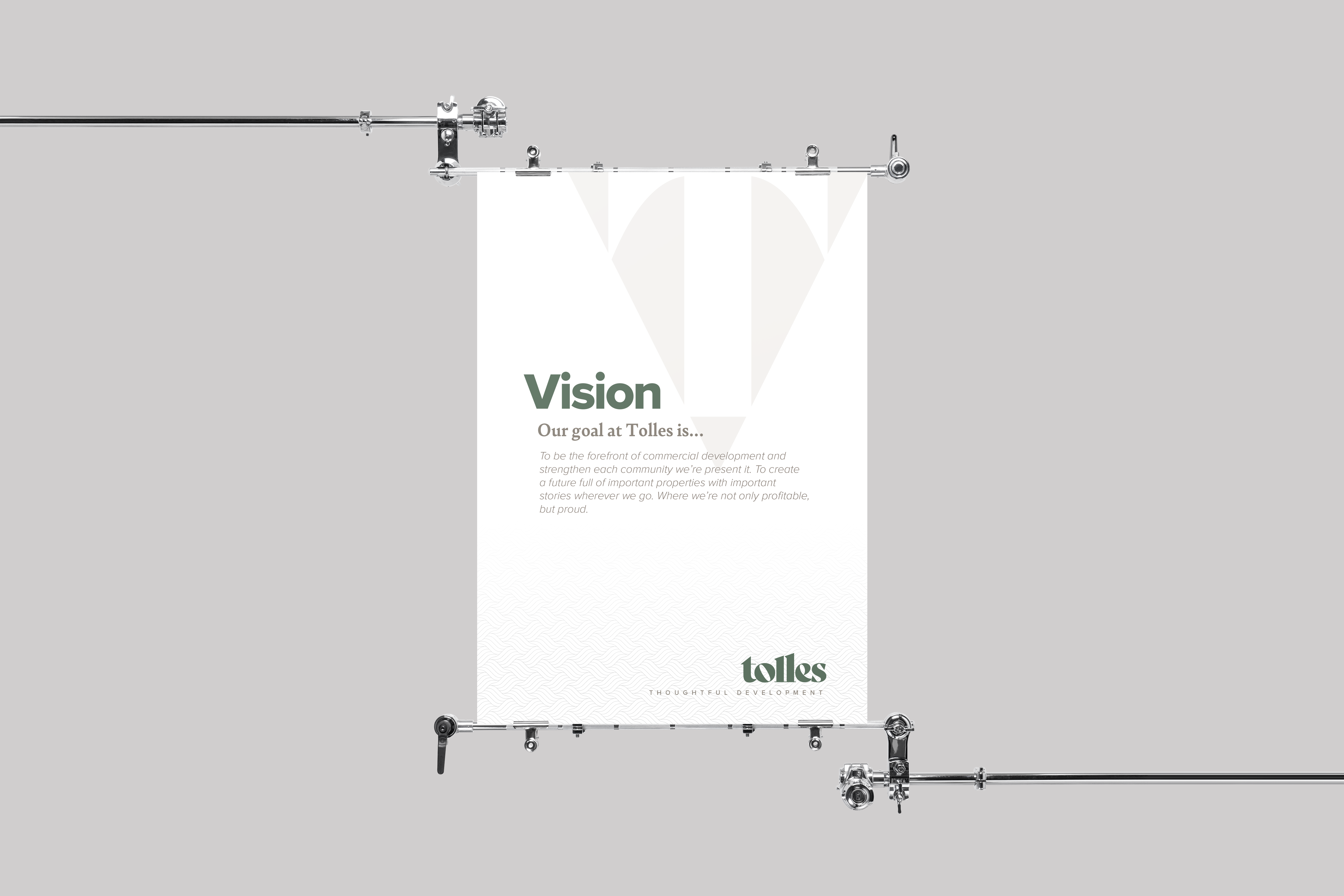
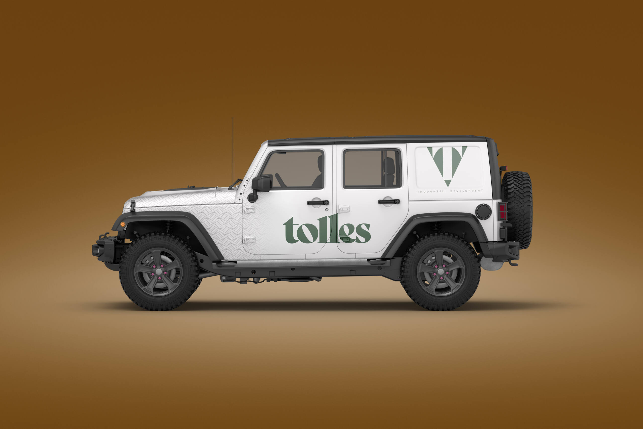
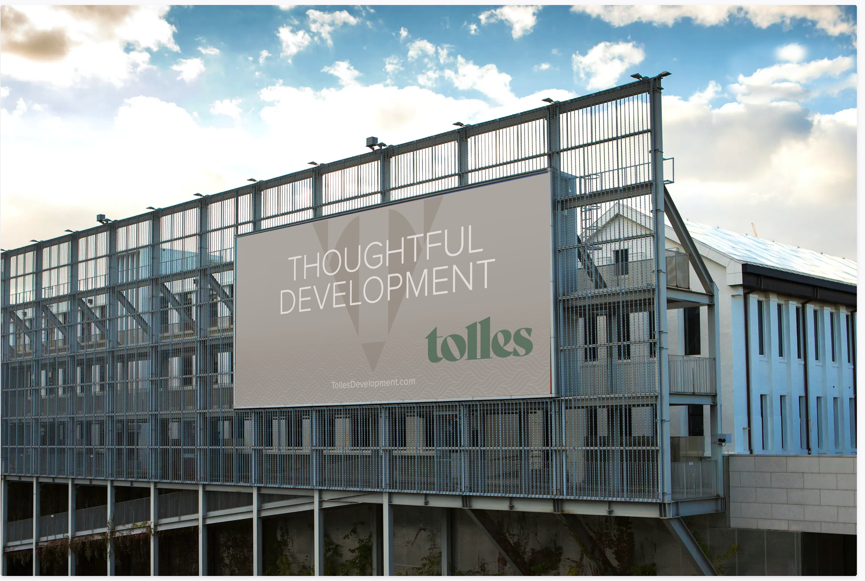
We reengineered the Tolles identity from the ground up by simplifying their voice, refocusing their principles, and crafting a compelling visual narrative that includes a complex pattern representing their ability to weave together multiple disciplines for greater results.