Healing Minds is the largest and leading mental health practice in Northern Nevada. They care deeply about providing behavioral health solutions for their community with an emphasis on “healing” and adapting to each person’s needs. Their goal is to give their clients the right tools for long-term growth and understand the importance of therapy and positive relationships.
We approached the Healing Minds brand with its mission and vision for the community in mind. Creating a welcoming and secure identity that translates effectively to their clients is what we do. Healing Minds’ previous logo was anchored by a very detailed dandelion icon that was difficult to reproduce and didn’t scale well across various sizes in the digital realm. In addition, the previous logo placed equal emphasis on both the name and tagline. This made people read the logo as a full sentence: “Healing Minds it’s what we do.”
With this in mind, we created a vibrant and optimistic logo that’s attractive and easy to apply in any situation. The softness of the dandelion icon is contrasted by the thick, bold lines of the wordmark set in the typeface Rebrand. This biggest shift, though, was using design to establish a hierarchy. “Healing” became the most important part of the name, bringing a fresh perspective and positive outlook to a well-established brand.
With new emphasis and a grinning font choice, the new logo has the energy of someone greeting you at the door with a smile – the “e” and “g” in “Healing” quite literally create the two corners of a smiling mouth.
To complement the boldness of “Healing,” we presented “MINDS” in the light version of the Rebrand typeface. This established the hierarchy that all descriptive, say-it-as-a-sentence names almost always need.
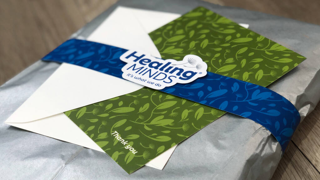
Like we mentioned earlier, the new dandelion icon is a stripped down take of the original, which included a full seed head with multiple pappi (yes, that’s what they’re called) floating away in the breeze. A nice idea, but far too complex to exist as a logo on its own. Instead, we reduced the form down to the floating florets themselves, signaling new opportunities ahead for those who wish for help. The two seeds rest gently on top of the word “Healing” create the tittle in the “i” (yep, that’s also what that’s called). The airiness of the dandelion seeds adds a delicacy to the logotype that keeps the heavy weight of the name from dominating.
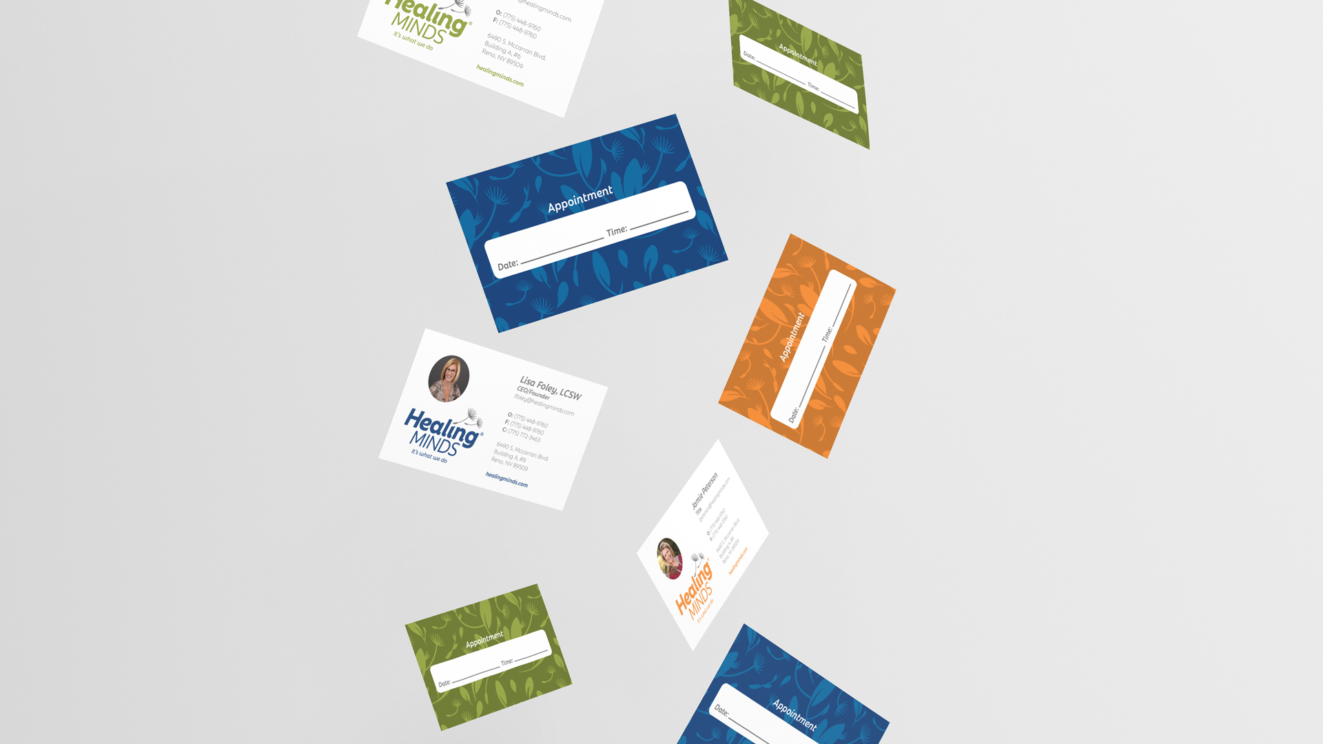
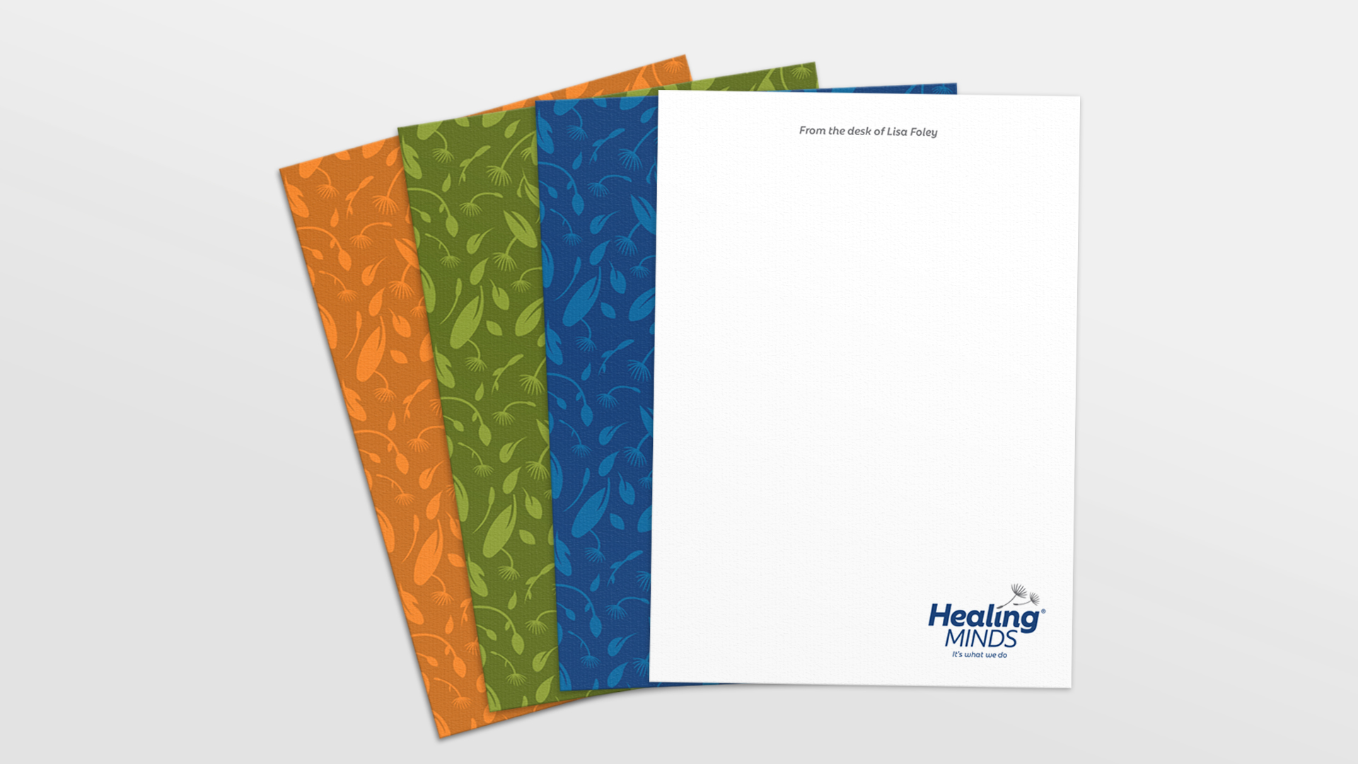
The color palette uses navy as the dominant color and complements with other bright, saturated earth tones in green and orange for some much-needed vibrancy. Extending the brand even further, we created an illustrated pattern made up of dandelions, leaves, and other various sprouts that emphasize the growth that comes through therapy. It’s also a nod to the abundance of plants and greenery that can be found throughout the Healing Minds office. The pattern is used sparingly throughout their design system to keep the focus clean and professional.
Business Card Designs
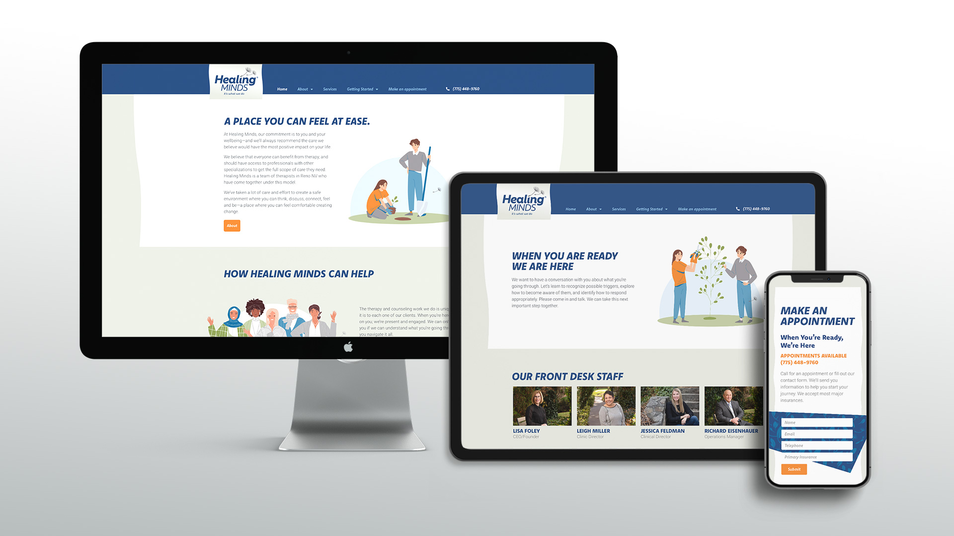
Website Design
Upon landing on the new Healing Minds website, the viewer is greeted with open arms. A welcoming feel was our inspiration for the layout, plus legibility and organization of all the content on the site. The UX system is simple and full of white space, which makes understanding the information on mental health services easier to the reader.
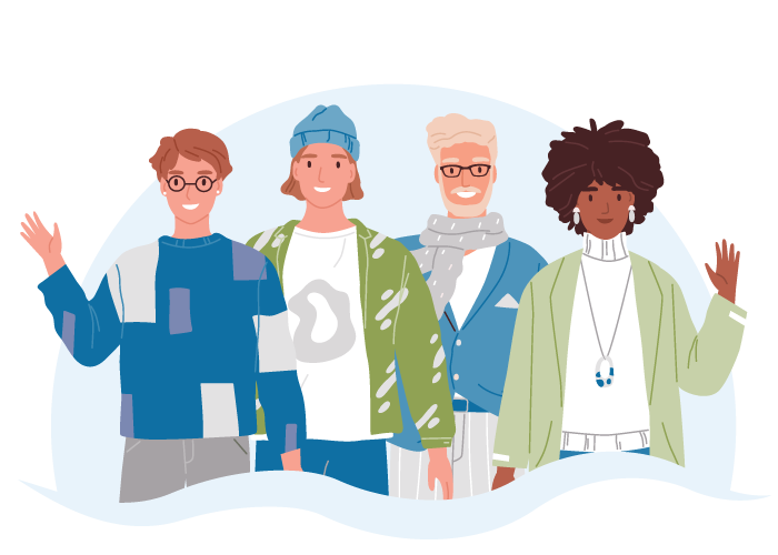
For most health services, photography is too literal and definite. The solution in these cases is always illustration. Illustration lets people, with all their individuality and unique personal image, easily paint themselves into a situation rather than compare to another human. It also gives us lots of creative freedom, representing each service offered in a distinct and artistic way.
The main theme of the illustrations: inclusivity. This eliminates those outdated stigmas around therapy and creates and inviting sense of hope. It’s all to further the Healing Minds belief that therapy should be available for everyone, regardless of background.
In contrast, we use high quality professional portraits of the staff and facility so potential clients can get a good feel of what it’s like to meet that therapist or visit the location. Big thanks to Jeff Ross Photography for providing the smiles.
Website Illustrations
"Our new brand and website is far beyond what we could have ever asked for. The Stan Can Design team saw things in our business that we've always struggled to articulate and helped us claim them as our own. We're so proud of where we've been able to take Healing Minds together.
Mobile Website
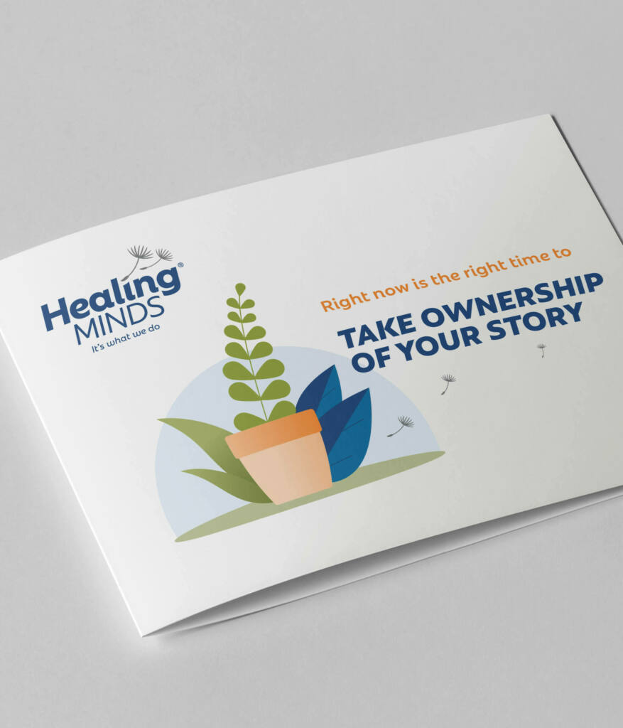
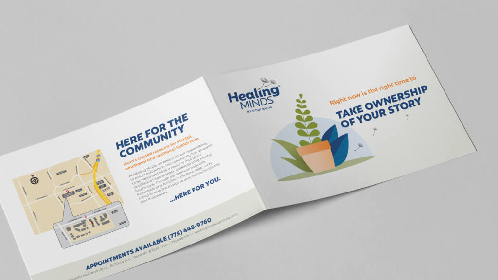
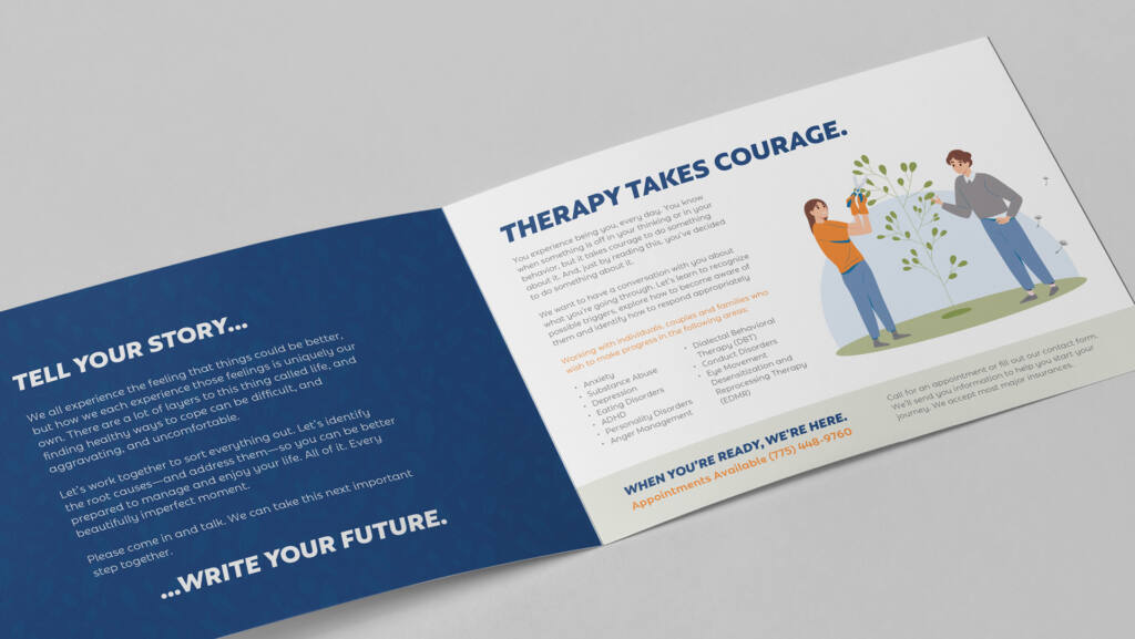
Brochure
Note Cards
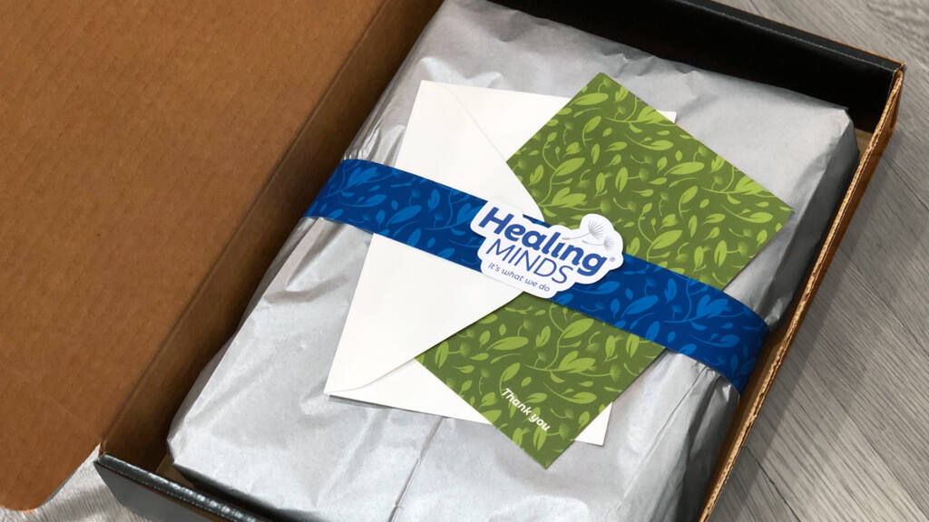
Embroidery and Package Design
We brought cookies (but no milk).
We use cookies to personalize content and ads to provide social media features and analyze our traffic. You may opt-out of the use of cookies through your browser settings, which allows you to delete cookies that have been set.