OneStudio D+A, formerly MBA Architects and Interiors, is the Northern Nevada region’s leading architecture and interior design firm. Since the firm was established in 1983, they’ve built a reputation for creating award-winning and dynamic spaces while amassing a large portfolio of projects. The firm has designed a number of award-winning buildings and spaces locally and across the country, including the Vintner’s Inn Spa in Santa Rosa, Mesa Rim Climbing and Fitness Center in Reno, Silver Legacy Spa, and the Hard Rock Casino and Hotel in South Lake Tahoe.
The MBA brand had a few problems to be solved, the first being the name itself. The letters “MBA” stood for partners who hadn’t been with the firm for years, which meant the brand had lost much of its meaning and ownership. Additionally, the company’s current partners were restructuring the firm leadership and needed a brand that wasn’t tied to any particular individuals, yet encompassed their unified team approach now and into the future. It was also important to create a sub-brand for their interior design division, Identity Design Lab, that could either stand alone or be easily integrated into business proposals and work flow.
Secondly, the MBA brand was no longer visually representative of the quality of the firm’s product. The firm had gained a reputation for award-winning work that was imaginative, inclusive, and interesting. They truly were pushing the envelope in designing the spaces in which we work, play, and live. Compared to their work, the company’s logo felt outdated and tried to do too much without actually communicating the firm’s unique approach to design.
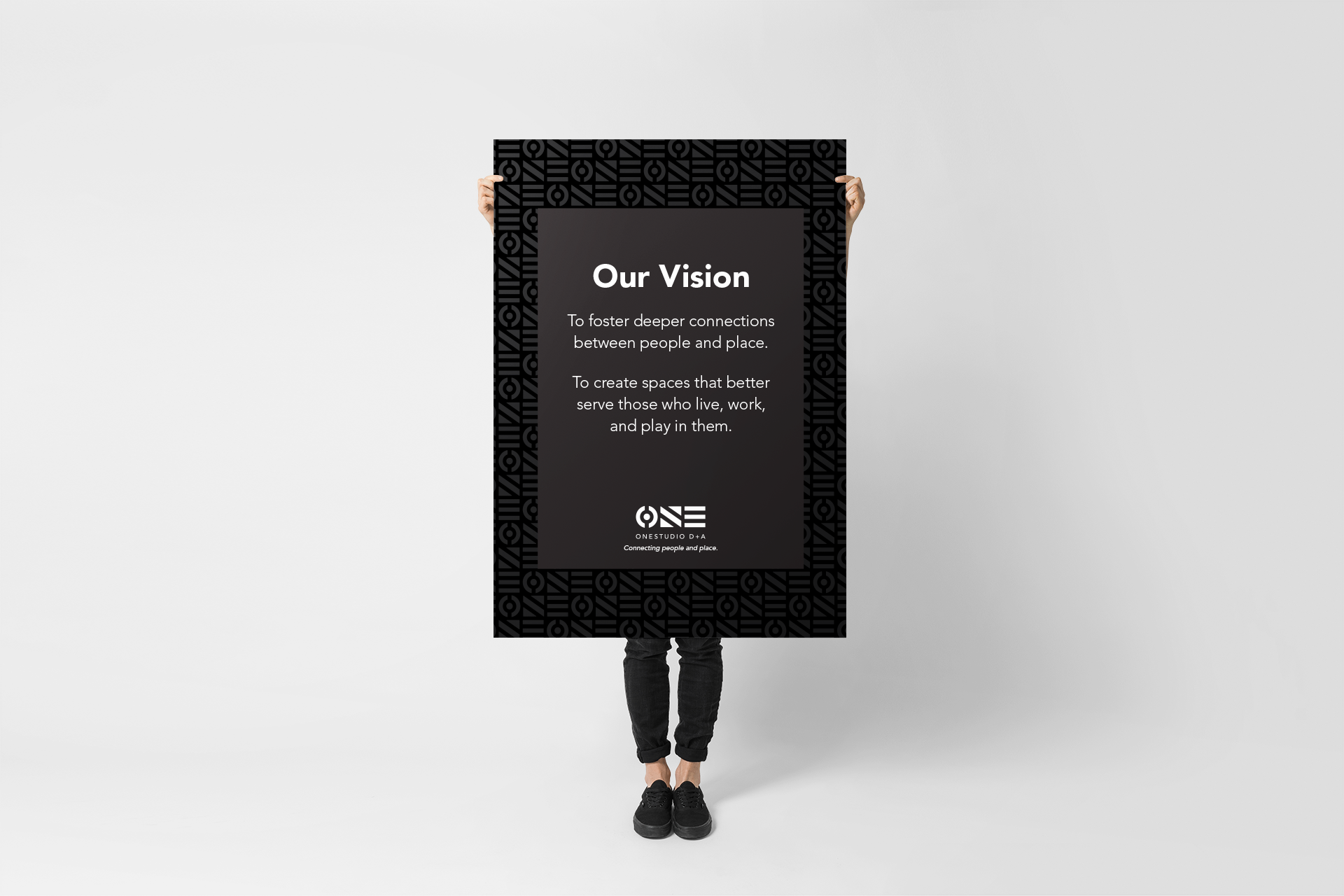
We distilled everything we learned from our insightOUT™ brand discovery process and came to the conclusion that connection is the single most important aspect of the OneStudio D+A brand. It’s apparent in the team’s penchant for constant collaboration, always coming together towards a common goal. It shows in OneStudio D+A’s process of combining architecture, interiors, and other disciplines of design to achieve the best results. Their team philosophy is to find the “why?” in every project in order to establish a deeper connection to their client’s vision. And by doing that, they’re taking the first step in designing spaces that better connect with the people who will use them, which in turn creates more connected communities wherever their company goes. When the client suggested the names OneStudio D+A and Identity Design Lab it was an easy decision to march forward with them.
The name OneStudio D+A captures the idea of collaboration within the team and with their clients, consultants, contractors, and other stakeholders. It also connects back to joining together, connecting, and being connected. The word “One” also can relate to people, as in “someone”, and puts people first.
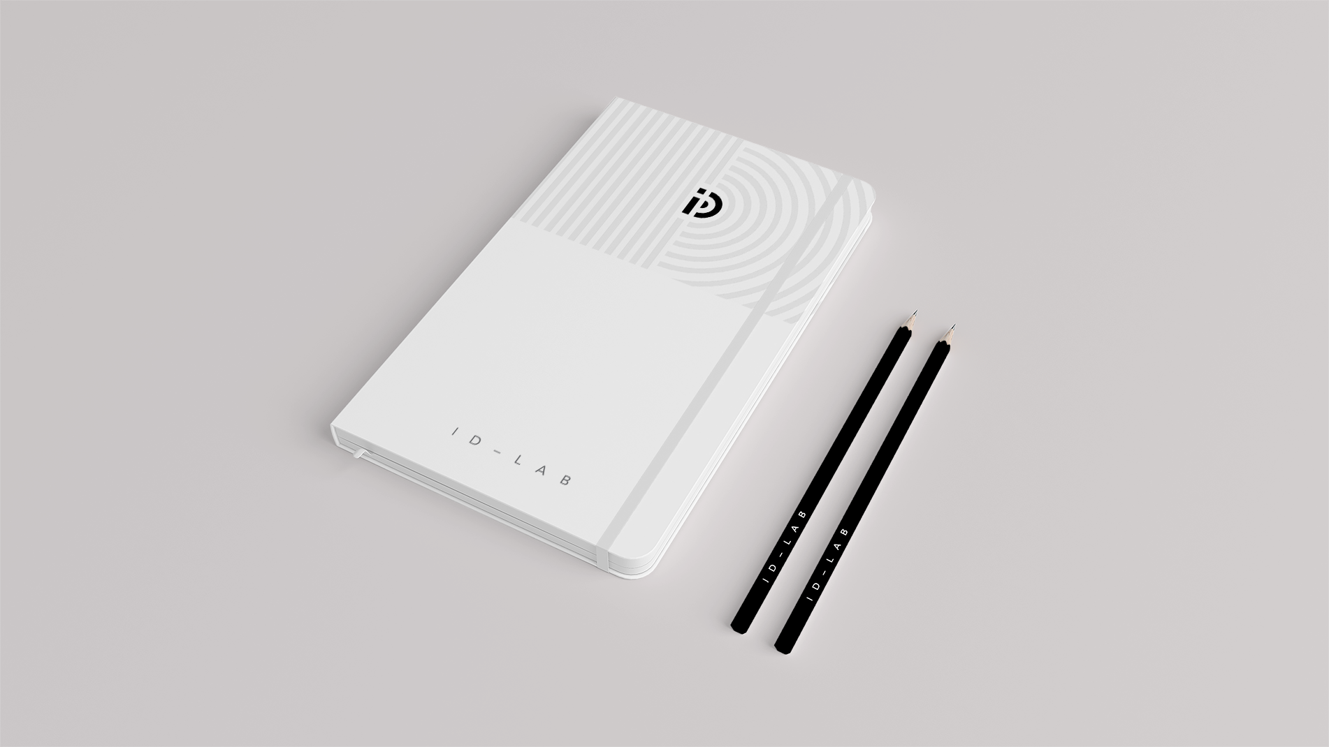
D+A (Design and Architecture) is meant to be pronounced as “D-N-A” and alludes to the identity they strive to establish behind in each of their projects. The D and A on their own are an ode to the joining together of both design and architecture towards a common goal.
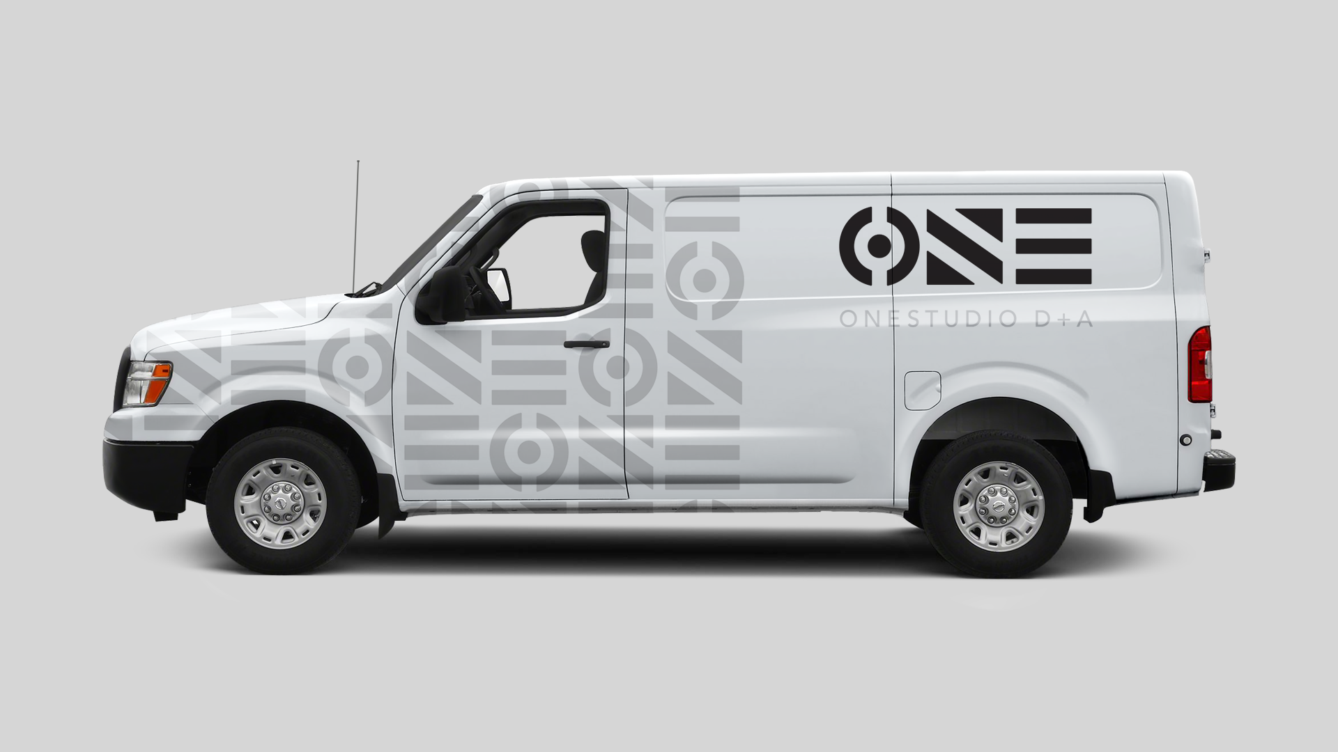
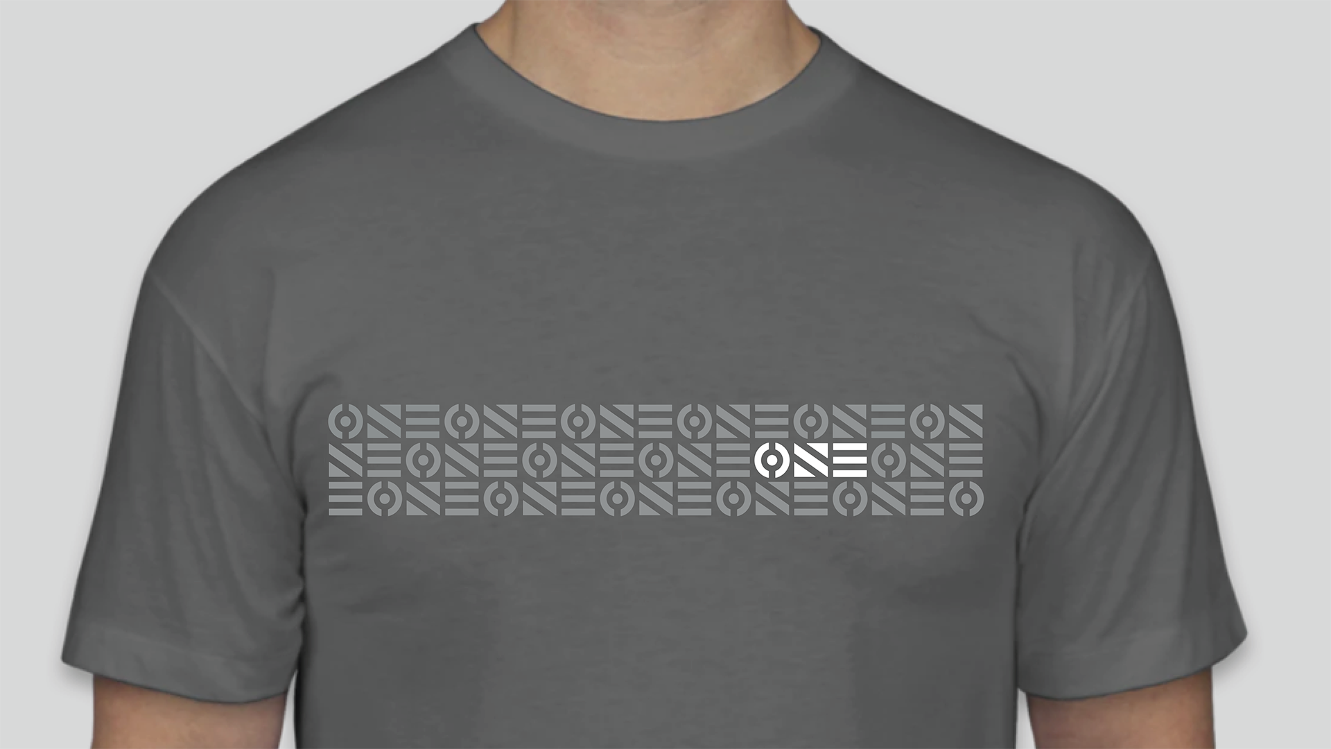
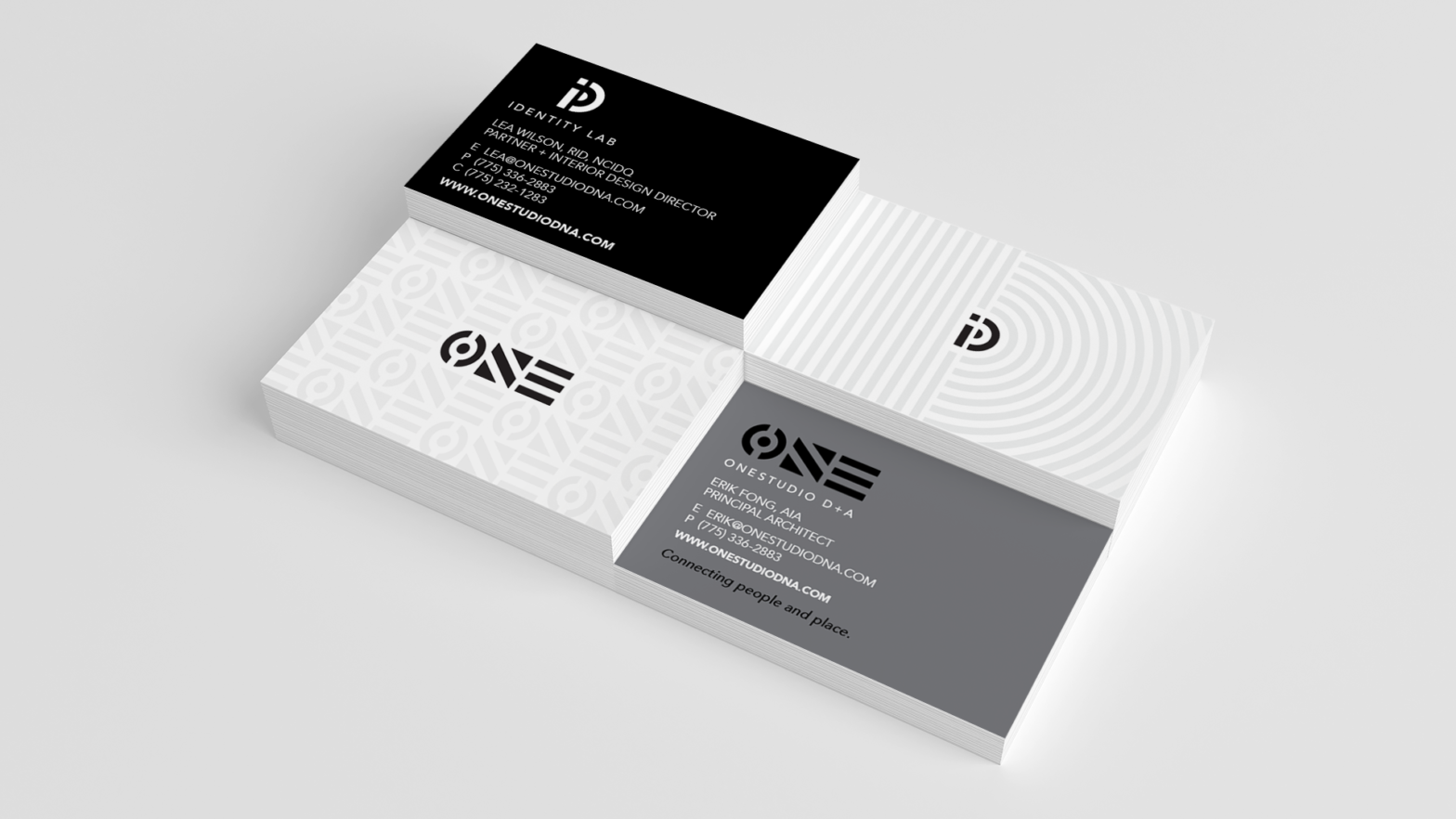
The design system relies on the typeface Avenir Next by Adrian Frutiger. Avenir is a geometric sans-serif typeface designed by Adrian Frutiger in 1987 and released in 1988 by Linotype GmbH. The word “avenir” is French for “future”. The ease with which this system is able to occupy spaces is because the pattern and logos work so well with each other. The relationship between the One and ID symbols is immediately recognizable. It doesn’t suggest a unified approach, it boldly claims it.
The black and gray color palette lets the work they do for clients shine through instead of competing for attention. By basing these free-flowing forms off of geometric shapes, the brand suggests a deep understanding of architecture and design. The logo has a ton of use potential when changing its orientation and creates a lot of opportunities for interesting designs in various applications.
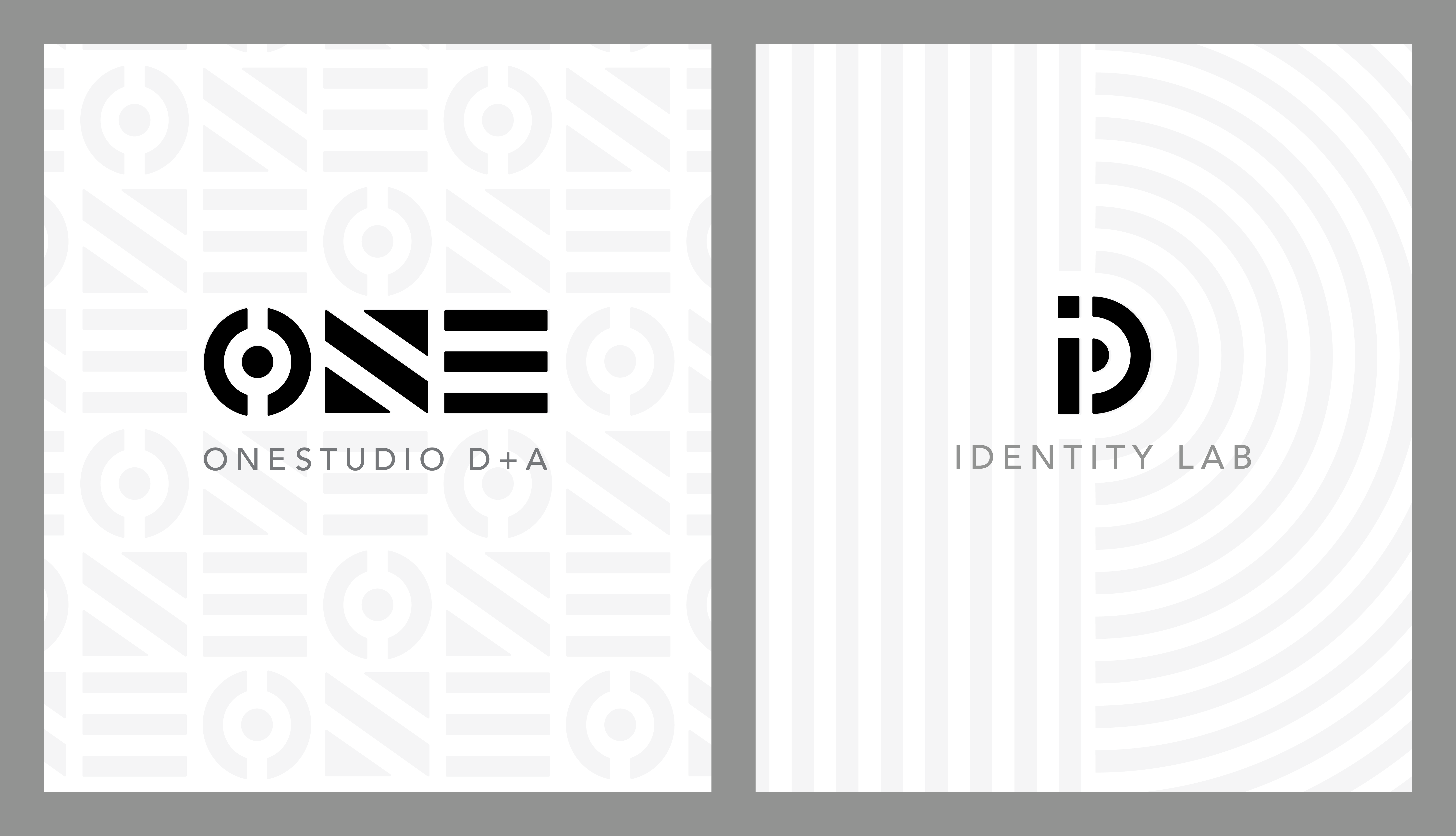
The second studio, IDentity Design Lab, operates under the OneStudio D+A parent brand but allows the team to devote equal resources and provide a unified approach for their clients. IDentity again refers back to D+A and also can be read as the “ID” (interior design) entity or group. The word “Lab” is intentional and hints that this side of the business will promote experimentation with new materials and conduct more research and development.
Designing two logos at the same time, both with interesting names, can be quite a challenge. Every change in the design process affected the other in unexpected ways. The mathematics to create the OneStudio background pattern had to be extremely precise to create a pattern that works in every direction.
We love how the negative spaces in the logotype connect the various pieces of the letterforms together. To us, it speaks to the brand pillars of connection and unity. Once-in-a-lifetime, the ONE logo creates a pattern that is perfectly symmetrical and it gets the little designer in us all giddy. The logo is flexible and versatile enough to be displayed either horizontally or vertically. We slightly rounded the corners on all of the letterforms to soften the edges and unify the logotypes.
Another favorite detail is the subtle architectural structures present in the logo’s letterforms. To us, they resemble modern buildings from a bird’s eye view. We love these kinds of subtle call-backs to a company’s offerings rather than obvious illustrations of services.
Initially, an earlier version of the logo had been approved and prototyped. The client came back and asked for some revisions that made the end result much better. Instead of telling us what to do, they explained what they thought wasn’t working and let us come back with a much better solution.
Visual influences for the brand include building blocks, the work of Michael Vanderbyl, and The Holy Trinity of circle, square, and triangle.
The client understood that trying to create traditional logos in the style of icons or illustrations was pedestrian, so we were able to focus on forms that expressed and celebrated the names themselves.
"The response to our new name and brand has been overwhelmingly positive. I feel our new brand will open up new business opportunities and assure current clients that we have our eye on the future. As a result of Stan Can Design's brand development process, our team has a new common confidence and sense of purpose."
Erik Fong – Principal Architect, OneStudio D+A