
The Washoe County Health District had a plan for a dynamic community wellness campaign that would give our local restaurants the resources needed to provide healthier menu options for customers. These options were things like smaller portion options and healthier kids menus that featured more fruits and veggies or devoid of sweetened drinks and fried foods. With the pieces in place, the program just needed a fun, flexible brand identity to gain recognition.
We Order Well (W.O.W!) was our answer. Since restaurants will be advertising these healthier menu offerings, the logotype needed to be versatile enough to work alongside tiny menu copy while also being recognizable at poster size. Most importantly, it needed to tell people the end result of making better eating choices: happiness.
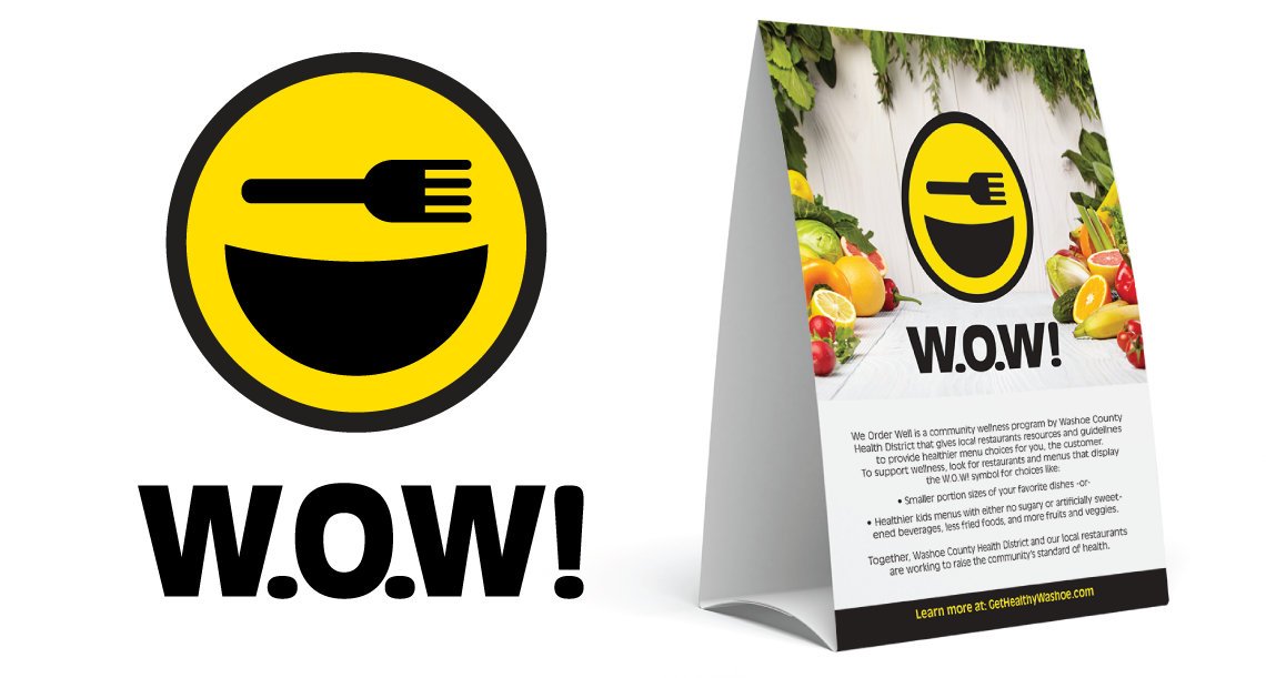
The name also does a lot of things for this identity. The acronymous nature gives it an official, “government program” nature while also making wellness fun and exciting. The extended name also talks about community and choice, while making wellness, not necessarily something so subjective as health, the goal.
With W.O.W!, the Washoe County Health District and our local restaurants are working together to raise the standard of wellness in our communities. Be sure to check out washoecounty.us/health for more info. And look for the happy plate next time you’re dining out!
