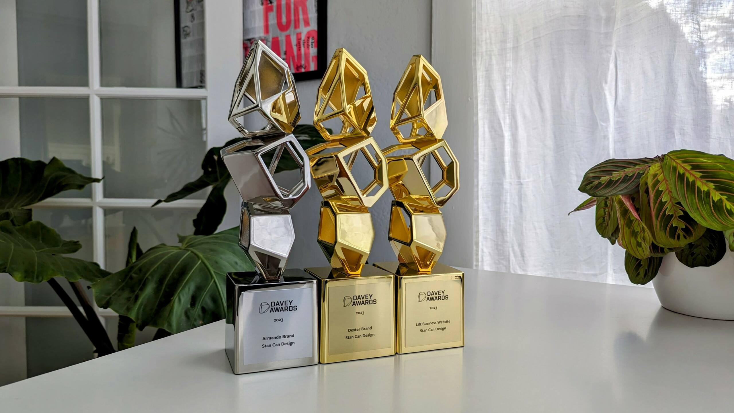
Stan Can Design Wins Gold and Silver at 19th Annual Davey Awards
Watch your head. We’re getting pretty good with a rock and a sling. Stan Can Design has once again been named winners at the Davey

Watch your head. We’re getting pretty good with a rock and a sling. Stan Can Design has once again been named winners at the Davey
Lost in the glitz, glam, and apocalyptic snow storms that signaled the waning days of 2022, we received news that the year’s best was saved
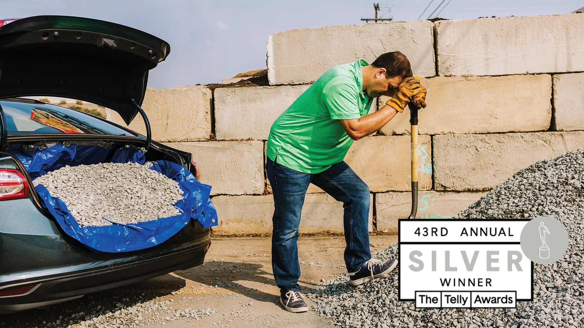
Stan Can Design is damn stoked to announce that we’ve picked up a Silver Telly Award for Western Turf’s “Next Day Delivery” Campaign. It’s the
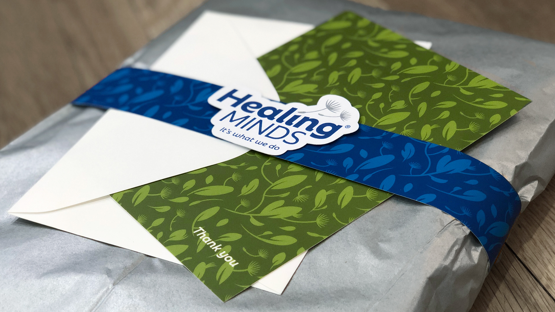
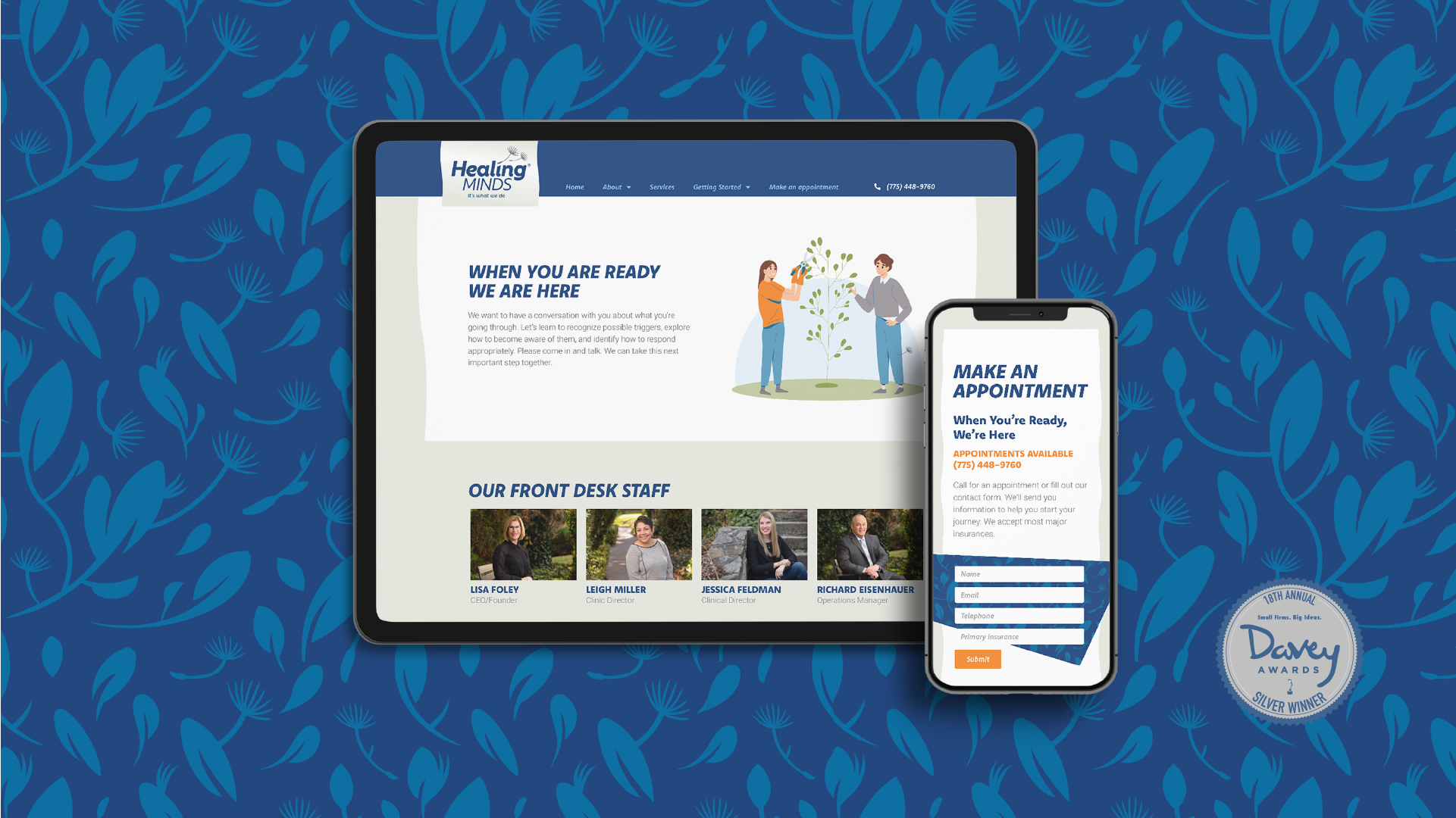
Healing Minds is the largest and leading mental health practice in Northern Nevada. They care deeply about providing behavioral health solutions for their community with
Look, there’s no way around this, so we’re just going to come out and say it: it’s been a minute. But while we’ve been away
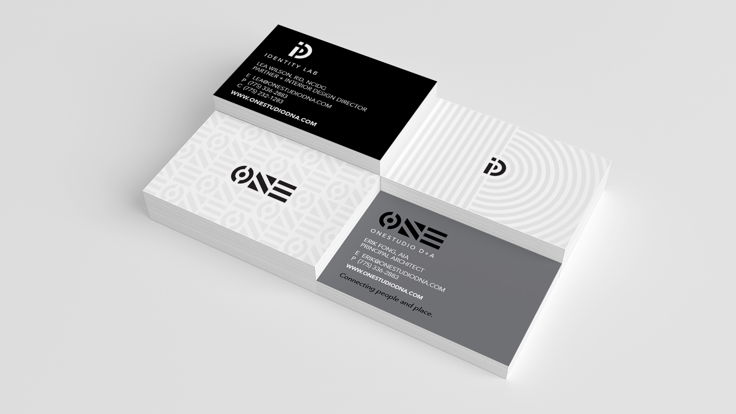
We’re honored to announce that our work for OneStudio D+A and IDentity Lab took home “Best Brand/Rebrand” at the 2021 Ace Awards by the Reno-Tahoe
OneStudio D+A, formerly MBA Architects and Interiors, is the Northern Nevada region’s leading architecture and interior design firm. Since the firm was established in 1983,

Anthony will bring exceptional design, illustration, and creative leadership skills to the firm’s roster of clients. Stan Can Design, a Reno-based advertising and design firm,
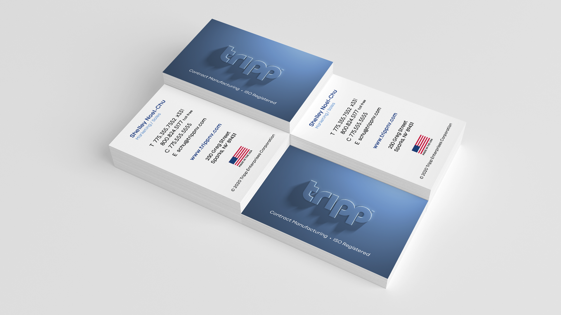
Change doesn’t come easy. And when you’re a regional manufacturing leader as established as Tripp Enterprises, the task can feel like trying to turn around
Stan Can Design’s current Associate Creative Director accepts a leadership role with the firm. Stan Can Design is pleased to announce that its current Associate
Blog Case Study: D Street Designs + Stan Can Design Previous Next Brand identity, logo design, and e-commerce website design for the custom jewelry king

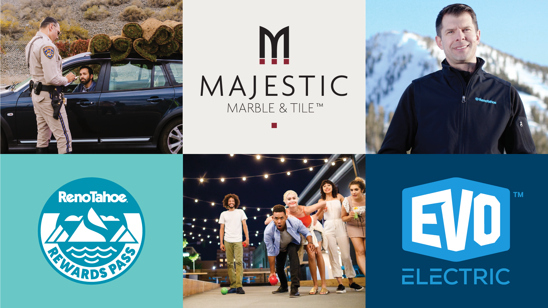
Blog Every City Needs a Hero (Shot) Anyone who’s been to Reno Tahoe knows it’s pretty hard to categorize. It’s a city, but has all
UNR 365 Learning’s 2020 Summer Session Few things have been as ubiquitous over the years as stickers. You probably can’t step out in public without
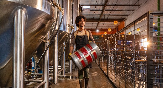
Blog Kicking Up Dust With Samco We’ve met a lot of people with secret identities, but never a company with one. Like the coworker you
Blog Employers 2019 Photo+Video Another year, another brilliant round of photography and video for EMPLOYERS, America’s Small Business Insurance Specialist. As the company completes their
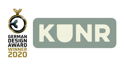
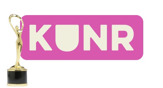
Blog KUNR Wins German Design Award Last we checked, the Germans knew a thing or two about good design. In fact, they even have something

Blog Artown 2019 Behind the Scene For the 9th consecutive year, Stan Can Design has had the pleasure of working with Artown and their featured
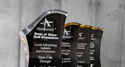
Blog StanCan Takes Gold at Communicators Award season continues to roll on. Fresh off of a Best in Show win at the local 2019 ADDY Awards, Stan
Time flies when you’re having fun. It’s already been one year since Kaylyn Dazey-Harper joined the Stan Can Design team! This illustrator extraordinaire has spent the last year flexing
Friday, March 8, AAF Reno held its 2019 American Advertising Awards celebrating the year’s best in local advertising. This year, Stan Can Design represented strong,
